Dear Atlas for Men Staff,
!! UNLESS YOU LOOKED AT ALL PREVIOUS 12 DESIGNS, PLEASE GO TO THE BOTTOM OF THE PAGE AND SEE THEM FIRST (design num. 1 is the logotype only design) !!
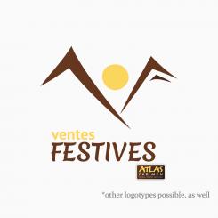
Here is my << 13. >> design, combined mark.
< THE PHILOSOPHY OF THE DESIGN >
- The mountains and sun represent nature and outdoors.
- The two mountains actually form a letter "V"
- The right mountain with its shade, little below it, together form a letter "F".
< DESIGN AND YOUR TARGET DEMOGRAPHY >
This design shall be liked by your target demography for suggesting mountains - nature, outdoors and for conveying the hidden two letters "V" and "F" that, when discovered, connect with the user on a new level, awarding the user with emotions.
< ABOUT ALL DESIGNS >
All my designs are in scalable (without quality loss) vector format. If you select me as the winner, together we can work on perfecting your most liked design solution, work on the colors and branding. In the end, I shall deliver the final design in both vector and high-quality .PNG format.
Thank You for paying attention to my work. I am looking forward to hearing your precious feedback.
Sincerely yours,
prof100Floyd
Logo for a new concept launched by the brand Atlas For Men.
- Contest holder: atlasformen
- Category: Logo design
- Status: Ended
Start date: 18-05-2015
Ending date: 16-06-2015
It all started with an idea...
A short, interactive guide helped them discover their design style and clearly captured what they needed.
Brandsupply is a platform where creative professionals and businesses collaborate on unique projects and designs.
Clients looking for a new logo or brand identity describe what they need. Designers can then participate in the project via Brandsupply by submitting one or more designs. In the end, the client chooses the design they like best.
Costs vary depending on the type of project — from €169 for a business or project name to €539 for a complete website. The client decides how much they want to pay for the entire project.
Dear Atlas for Men Staff,
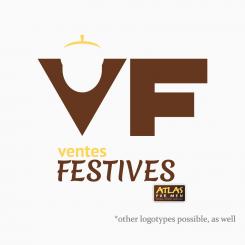
Here is my << 12. >> design, combined mark.
< THE PHILOSOPHY OF THE DESIGN >
- This design of mine, is, as well, turned primarily towards representing nature and outdoors. The monogram "VF" contains a hidden acorn cut into the letter "V", with its top highlighted above the letter "V".
< DESIGN AND YOUR TARGET DEMOGRAPHY >
This design shall be liked by your target demography because it conveys the message of nature and outdoors through a hidden, clever meaning using the letter "V".
Please continue to my << 13. >> design, another solution for the combined mark logo.
Dear Atlas for Men Staff,
Here is my << 11. >> design, combined mark.
This design utilises the same concept as my previous design, but with using different line styles and overlaps.
Please continue to my << 12. >> design, another solution for the combined mark logo.
Dear Atlas for Men Staff,
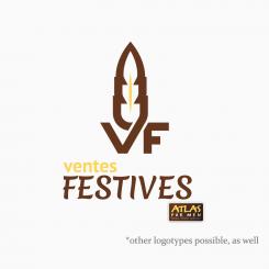
Here is my << 10. >> design, combined mark.
< THE PHILOSOPHY OF THE DESIGN >
- This mongram design is primarily turned towards representing nature (which also represents outdoors) through a feather, formed by the letters "V" and "F".
< DESIGN AND YOUR TARGET DEMOGRAPHY >
This design shall be liked by your target demography for its outdoors message, as the feather can represent an object from the nature, or, a collector's item as many people in your target demo age group are collectors of some sort of items.
Please continue to my << 11. >> design, another solution for the combined mark logo.
Dear Atlas for Men Staff,
Here is my << 9. >> design, combined mark.
This design utilises the same form as my previous design, but with using the 4. version of the logotype I designed.
Please continue to my << 10. >> design, another solution for the combined mark logo.
Dear Atlas for Men Staff,
Here is my << 8. >> design, combined mark.
This design utilises the same form as my previous design, but with using the 3. version of the logotype I designed.
Please continue to my << 9. >> design, another solution for the combined mark logo.
Dear Atlas for Men Staff,
Here is my << 7. >> design, combined mark.
This design utilises the same form as my previous design, but with using the 2. version of the logotype I designed.
Please continue to my << 8. >> design, another solution for the combined mark logo.
Dear Atlas for Men Staff,
Here is my << 6. >> design, combined mark.
< THE PHILOSOPHY OF THE DESIGN >
- The price tag look of the logomark combined with the logotype suggest shopping and discounts.
- Instead of using the generic hole cut in the price tag shape, I used outlines of compass to hint outdoors and outdoor sports.
< DESIGN AND YOUR TARGET DEMOGRAPHY >
This design shall be liked by your target demography for its straightforward message which is primarily discounts and shopping, and for its side message represented through the the compass cut on the right.
Please continue to my << 7. >> design, another solution for the combined mark logo.
Dear Atlas for Men Staff,
Here is my << 5. >> design, combined mark.
< THE PHILOSOPHY OF THE DESIGN >
- The chest and light rays represents rarity, uncovered gold - in your case, quality products which are not available on your website, but only revealed on Ventes Festives each month just to your customers. This hints exclusivity, rarity.
- The rope around the chest is something that every outdoor lover owns. It represents outdoor / outdoor sports. This also hints nature.
< DESIGN AND YOUR TARGET DEMOGRAPHY >
This design shall be liked by your target demography for its simplicity and for the outdoor and rare exclusives message that it conveys.
Please continue to my << 6. >> design, another solution for the combined mark logo.
Dear Atlas for Men Staff,
Here is my << 4. >> logotype only design. Using its bold letters and clear sans-serif contours, this logotype design gives a strong, simplistic overall look. Please continue to my << 5. >> design, which is my first solution for the combined mark logo: logomark + logotype.
Dear Atlas for Men Staff,
Here is my << 3. >> logotype only design. Its young-alike but also classy because of the serif addons. Please continue to my << 4. >> design.
Dear Atlas for Men Staff,
Here is my << 2. >> logotype only design. It incorporates a sans-serif font for a casual overall look. Please continue to my << 3. >> design.
Dear Atlas for Men Staff,
I've designed several different professional, unique designs that each tackle your target demographic in their own way and represent a special sub-brand nested inside your company. The first 4 designs are logotype only logos.
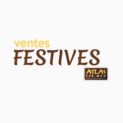
This is the << 1. >> logotype design, with the word "Festives" in handwritten alike font.
Please continue to my << 2. >> design.
 Nederland
 België
 France
 Deutschland
 Österreich
 United Kingdom
