No comments
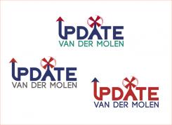
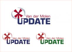
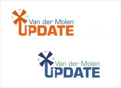
Logo for business consultant
- Contest holder: henrietvandermolen
- Category: Logo design
- Status: Ended
Start date: 11-07-2016
Ending date: 18-07-2016
It all started with an idea...
A short, interactive guide helped them discover their design style and clearly captured what they needed.
Brandsupply is a platform where creative professionals and businesses collaborate on unique projects and designs.
Clients looking for a new logo or brand identity describe what they need. Designers can then participate in the project via Brandsupply by submitting one or more designs. In the end, the client chooses the design they like best.
Costs vary depending on the type of project — from €169 for a business or project name to €539 for a complete website. The client decides how much they want to pay for the entire project.
Thank you!
My Pleasure!
I like the fact that the mill and the flower have a connection. They fit together. So movement and growth have a connection. Something to think about... Thank you.
Yes, that is absolutely right Sir!
Just out of curosity, what do you use the colour palette that you have for. It is cut from grament/cloth piece's right. Just curious, don't mind. Answer if you wish to else nothing to concern about :-)
It's my personal color palet. I had a color and style advice session and this palet was the result. So I use it for cloths, but also for choosing the color of my laptop case. And thus, also for the colors that are used in my logo.
Nice! Thanks for answering!
It's actually good to have it, gives clearity of choice in mind regarding what you want.
True. Can recommend it to everyone!
Yes Sure! I do have my persoanl pallete, but it is for Designing mostly but can be applicable for other purposes as well. Can upload it for you, but than all designers shall have it, shall email it to you.
No worries, I have my own palet, you have yours, that's great!
:-) It' been pleasure working and talking to you!
Tkcr. Have a good life Ahead!
Kind Creative Regards,
Rusty
No comments
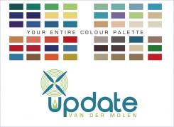
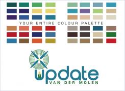
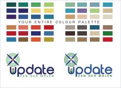
Here is a new Design version, along with your entire colour Palette. Have not used many multiple colours as it makes the Design playful and losses it's business and professional touch. Have used the colours only from your palette which have picked from the files you had uploaded and placed them in squares here above the designs for your reference.
Kind Creative Regards,
Rusty
No comments
Is it design or the colour,
Because when I am using your colour combination from your files, it seems it is not pleasing you. Please tell!
Hello,
Good question. Because many new designs were uploaded, I got a bit confused :-)
I do like the colors in this design. Also the font is very nice. But I have seen designs of the
U/Mill that I like better than this one.
Well, I could have worked on mill if I had know.
I kept thinking that colours are not pleasing.
Verywell, shall work on mill and upload a new design soon.
Thankyou for the feedback, communication helps in designing. :-)
True! Perhaps you can elaborate on the use of a spiral in the mill, as only one designer has used that. I like the symbolism of the spiral = growth.
 Nederland
 België
 France
 Deutschland
 Österreich
 United Kingdom
