No comments
Design a new logo for a top TEDx speaker and communications expert.
- Contest holder: DavidJPPhillips
- Category: Logo design
- Status: Ended
Start date: 04-11-2017
Ending date: 11-11-2017
It all started with an idea...
A short, interactive guide helped them discover their design style and clearly captured what they needed.
Brandsupply is a platform where creative professionals and businesses collaborate on unique projects and designs.
Clients looking for a new logo or brand identity describe what they need. Designers can then participate in the project via Brandsupply by submitting one or more designs. In the end, the client chooses the design they like best.
Costs vary depending on the type of project — from €169 for a business or project name to €539 for a complete website. The client decides how much they want to pay for the entire project.
Hello,
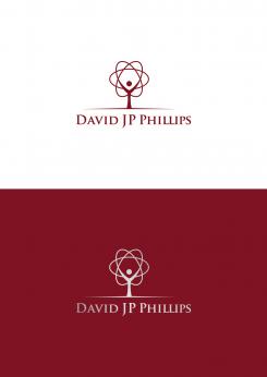
I make changes with logo. I make upper part to look more like tree but it also reminding for scientific symbol.
Let me know what do you think.
Regards,
Krisi
No comments
Thanks for your contribution Krisi! I like your example. Could you explain to me how you have thought?
Hello,
My logo present stylized man with hands up. Hands are part for scientific symbol. In same time man + scientific symbol are in the shape of tree (symbol of growth).
Let me know if I can be more helpful.
Regards,
Krisi
Hi!
Of all the logos I've shortlisted a couple, whereof yours is one.
Do you see any possibility of making the man/tree centered above the JP it feels a bit unbalanced. I can't see any way but maybe you're more creative then me.
Also, its slightly to scientific. Any ideas on how we could tone that down slightly?
 Nederland
 België
 France
 Deutschland
 Österreich
 United Kingdom


