No comments
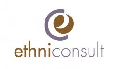
LOGO for wealth management consulting
- Contest holder: PAULETTE13
- Category: Logo design
- Status: Ended
Start date: 13-01-2018
Ending date: 23-01-2018
It all started with an idea...
A short, interactive guide helped them discover their design style and clearly captured what they needed.
Brandsupply is a platform where creative professionals and businesses collaborate on unique projects and designs.
Clients looking for a new logo or brand identity describe what they need. Designers can then participate in the project via Brandsupply by submitting one or more designs. In the end, the client chooses the design they like best.
Costs vary depending on the type of project — from €169 for a business or project name to €539 for a complete website. The client decides how much they want to pay for the entire project.
No comments
What can I do to make it a five star winner ;-)
First Keep your humor :)
It will be a suffrage with the team but your proposal is very good !
No comments
I love this project ; can you please :
decline in yellow (mustard) / Grey +++
and can you also please put the C of ethiconsult in the twice color , it will be easier to "Read" ethic whic is the same C with Consult
thanks a lot
valérie
Hello Valérie,
actually it's some king of gold and metallic silver ;-)
what do you mean bij 'decline the colors' exactly? Do you prefer a version with warm yellow and grey instead?
In fact on my screen it's not gold but brown and silver is grey :)
I think that Gold and silver are beautiful but it's difficult to reproduce on paper that's why it seems to be easier if it's yellow (mustard) and grey
Thanks a lot
 Nederland
 België
 France
 Deutschland
 Österreich
 United Kingdom
