No comments
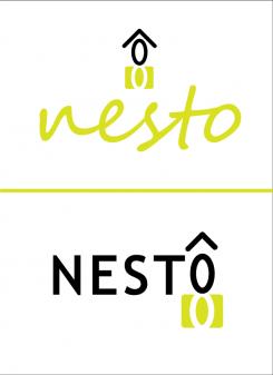
New logo for sustainable and dismountable houses : NESTO
- Contest holder: Luxusbierger
- Category: Logo design
- Status: Ended
Start date: 25-06-2016
Ending date: 09-07-2016
It all started with an idea...
A short, interactive guide helped them discover their design style and clearly captured what they needed.
Brandsupply is a platform where creative professionals and businesses collaborate on unique projects and designs.
Clients looking for a new logo or brand identity describe what they need. Designers can then participate in the project via Brandsupply by submitting one or more designs. In the end, the client chooses the design they like best.
Costs vary depending on the type of project — from €169 for a business or project name to €539 for a complete website. The client decides how much they want to pay for the entire project.
as requested with tagline "BUILD TO BE REBUILT"
No comments
does not look good.. txs... one more request: the text below nesto: built to be rebuilt
attached is the logo with the requested changes. de s is more in line with the other letters and the roof sides are removed from the house. should you want to see other changes do let me know.
sorry... wanted to write does look good!!!! typing error
i am glad to read your correction. and glad you like it! above is the logo with the tagline corrected.
Congratulations to you, Kreative Kolor!
No comments
One idea to integrate health / human centered aproach to the logo is to add a leaf. This design has a clean look to it, I am afraid however that adding a leaf will make it to busy. I will give it a try nevertheless.
Dear Kreative Kolor,
could I ask you to try a design where the S is of the same size than the rest of nesto? and also with a design of the house where the roof does not hang over the walls?
Txs in advance,
Luxusbierger
No comments
I added this image to showcase the logo as it would look like printed.
Thnaks, for the moment, this is really not a bad idea, ...
we will have to wait and see what else is proposed to us.
Could you just try one more thing for the moment: a proposal with the statement underneath: build to be re-build... and any idea about how to integrate the healthy idea, or the human centered approach?
Thanks again for your efforts so far.
Regards,
No comments
Here you ago with the S turned into an infinity symbol.
I am glad to see we have come to a logo that appeals to you. would you like to see other changes to arrive at a 5 starrating?
No comments
but again this is not to bad, and maybe the S could become lso the infinity symbol :-) now that you highlighted the S :-)
Regards,
No comments
The logo here has the house, recycling and the infinity incorporated in an image that is still sleek and stylish. the house below is more minimal. I personally prefer the logo above.
yes seems even better than the prvious one... hat is a good basis to continue working
do you have some feedback on what you would like to see changed?
difficult for me to say.. may be try with different handwriting and differnt colour..
regards, and txs for your proposals
that makes it difficult to create something special. i will give it one more try.
that makes it difficult to create something special. i will give it one more try.
No comments
Unfortunate to see the below nest design did not appeal to you. this design incorporates the infinity logo in the house and front lawn. any feedback is much appreciated.
I see the symbol inifnity appearing right now, looks already better, also the colour choice, but still it will not be our favorite.
Regards,
Jeannot
 Nederland
 België
 France
 Deutschland
 Österreich
 United Kingdom
