No comments
Raise together
- Contest holder: RAISETOGETHER
- Category: Logo design
- Status: Ended
- Files: File 1, File 2
Start date: 02-04-2016
Ending date: 07-04-2016
It all started with an idea...
A short, interactive guide helped them discover their design style and clearly captured what they needed.
Brandsupply is a platform where creative professionals and businesses collaborate on unique projects and designs.
Clients looking for a new logo or brand identity describe what they need. Designers can then participate in the project via Brandsupply by submitting one or more designs. In the end, the client chooses the design they like best.
Costs vary depending on the type of project — from €169 for a business or project name to €539 for a complete website. The client decides how much they want to pay for the entire project.
don't like the sharp edges of the screw part
No comments
don't like the sharp edges of the screw part
if you'd make from this design the edge of screw part softer, I think it will be perfect
No comments
I like this the best, because of soft curves. maybe the screw part can become bigger
can the white part become transparent in execution?
can the white part become transparent in execution?
No comments
Thanks very much for offering that many variants. The last one you uploaded I find the best: fresh color, with illumination effect, raising people, jester cap, light bulb as a symbol for inspiration and a dialogue image. All in one. Still minimalistic. The outer line of the dialogue symbol is darker orange. What would it look like if exactly this darker orange colour would be used for JESTER and RAISING brands?
Thanks very much for offering that many variants. The last one you uploaded I find the best: fresh color, with illumination effect, raising people, jester cap, light bulb as a symbol for inspiration and a dialogue image. All in one. Still minimalistic. The outer line of the dialogue symbol is darker orange. What would it look like if exactly this darker orange colour would be used for JESTER and RAISING brands?
Would it be possible to sophisticate the screw part of the light bulb?
No comments
a bit too aggressive in colour
No comments
Hello,
Thanks for your feedback, i hope I understand your feeling.
best regards
Hello,
her my design. Don't hesitate to give me your felling to evolve your logo.
best regards
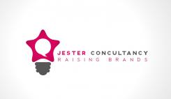
Hi Update, Creatively very nice work. I see a light bulb, a talking-cloud as in dialogue, a star to which one could raise, and 5 people communicating with each other. Also one could see the jester cap from a top view. So there's very much in it. Consultancy is with an S instead of a C. :) The design is nicely integrated. Well done! Perhaps you can make the link to the jester cap even more prominent, without losing the 'star'? The glass part of the bulb can be the dialogue-cloud, so the effect of the light bulb will not be affected with that change. Hope to see something from you! Also, would you mind designing with a warm,deep orange colour? Not the typical 'Dutch' orange, but warmer and deeper in colour, getting closer to red. Thanks!
Hi Update, Creatively very nice work. I see a light bulb, a talking-cloud as in dialogue, a star to which one could raise, and 5 people communicating with each other. Also one could see the jester cap from a top view. So there's very much in it. Consultancy is with an S instead of a C. :) The design is nicely integrated. Well done! Perhaps you can make the link to the jester cap even more prominent, without losing the 'star'? The glass part of the bulb can be the dialogue-cloud, so the effect of the light bulb will not be affected with that change. Hope to see something from you! Also, would you mind designing with a warm,deep orange colour? Not the typical 'Dutch' orange, but warmer and deeper in colour, getting closer to red. Thanks!
Hi Update, Creatively very nice work. I see a light bulb, a talking-cloud as in dialogue, a star to which one could raise, and 5 people communicating with each other. Also one could see the jester cap from a top view. So there's very much in it. Consultancy is with an S instead of a C. :) The design is nicely integrated. Well done! Perhaps you can make the link to the jester cap even more prominent, without losing the 'star'? The glass part of the bulb can be the dialogue-cloud, so the effect of the light bulb will not be affected with that change. Hope to see something from you! Also, would you mind designing with a warm,deep orange colour? Not the typical 'Dutch' orange, but warmer and deeper in colour, getting closer to red. Thanks!
 Nederland
 België
 France
 Deutschland
 Österreich
 United Kingdom


