Hello Robert!
Thank you very much for the quick response and the rating!
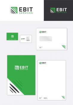
Here is my logo proposal with a bit darker shades of green and grey. I agree with you that my first color proposals was a bit too light and not enough distinctive. I also created an option for the business cards, envelope (C5) and letterhead + cover layout.
Please, let me know what you think. I’m open if you need to make any other color or other improvements.
Looking forward to hear your next feedback.
Thank you!
Dari
Design logo and corporate identity for start-up company in technology
- Contest holder: ebit-services
- Category: Logo & stationery
- Status: Ended
Start date: 16-11-2017
Ending date: 16-12-2017
It all started with an idea...
A short, interactive guide helped them discover their design style and clearly captured what they needed.
Brandsupply is a platform where creative professionals and businesses collaborate on unique projects and designs.
Clients looking for a new logo or brand identity describe what they need. Designers can then participate in the project via Brandsupply by submitting one or more designs. In the end, the client chooses the design they like best.
Costs vary depending on the type of project — from €169 for a business or project name to €539 for a complete website. The client decides how much they want to pay for the entire project.
Looks good! You will be one from witch i will choose at the end of the campain! Very good job!
Thank you very much for the comment Robert!
I'm on your disposal if you want to make any revisions.
Have a great weekend!
Dari
Hello!
Here are my first proposals for your logo. Please, let me know if I’m on the right direction with some of them. Everything could be changed, so please don’t hesitate to ask me for revisions or new options.
Here are some thoughts from me: I made two concepts with a bit abstract symbols. I think that the abstract symbol is more suitable for the consultancy branch. Because if the logo is more obvious and literal, then it gives more specifically technical sense.
I tried to incorporate the idea of forward thinking, moving ahead and to respond well with the company profile and services - elektro, IT, telecom etc.
I’ll look forward to hear what you think.
Kind regards,
Dari
I like the first one you send, and the story with the logo is good. Can you maby play some with the colors. I think the geen is a bit to light to display on white, same for the gray. Maby both some more dark, not to much offcourse. Any ideas how it would look on business cards, quotations and stationery?
Thanks!
Robert
 Nederland
 België
 France
 Deutschland
 Österreich
 United Kingdom


