Dear fitnessdistribution,
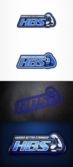
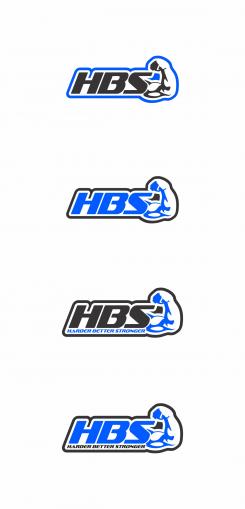
First two are for printing, I add a white stroke to letters and now letters are more standing out,colors are black, two grays(two look more like silver color)and electric blue, i think that now looks more strong and things are more pointing up, the second is another solution where i try to blue be more dominant color,there i needed to add a another stroke,about embroided version i try to make it realistic so this is best i can get, but i think it will look more better when its actualy sewn especially with flashy blue thread, and last one i add is glossy metalic look, it can be used on web or like metal plates for equipment even as a badge.I hope you like it.
Best Regards,
Misa84
H B S Harder Better Stronger - Bodybuilding equipment
- Contest holder: fitnessdistribution
- Category: Logo & stationery
- Status: Ended
- Files: File 1
Start date: 06-08-2016
Ending date: 13-08-2016
It all started with an idea...
A short, interactive guide helped them discover their design style and clearly captured what they needed.
Brandsupply is a platform where creative professionals and businesses collaborate on unique projects and designs.
Clients looking for a new logo or brand identity describe what they need. Designers can then participate in the project via Brandsupply by submitting one or more designs. In the end, the client chooses the design they like best.
Costs vary depending on the type of project — from €169 for a business or project name to €539 for a complete website. The client decides how much they want to pay for the entire project.
Dear,
This is embroided version when the logo is inverted, so the black leather itself will give the letters and arm the shadow,i think its better when it is sewed like this.
regards
Misa84
Dear,
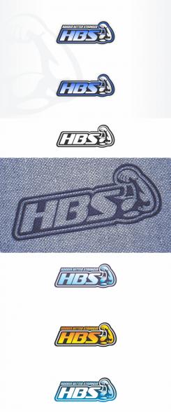
I modify arm,think its more visible now, there is more variations of colors and i try approximately to make how whould it look like when its sewn.
Regards Misa84
thanks... so far the best one. Good job
could you please keep this version, and do a few things:
1) for the embroided version, please use black leather background, and nice flashy electric blue thread
2) Printed version. I do not like how u put the colors, because it looks faded. Please make one version with black, blue and silver combination, but as a STRONG logo. A bit like the yellow one, but in blue and even stronger. 100% fill, put light effects, volume/3D....
thanks a lot.
For the embroided, no text.
For the print, text on top as you did is nice.
Arm and hand are nice too
No comments
hi, looks nice, thanks.
could you please make one version in only 2 colours on white background, no gradients. This is for the sewing on the bench. I want to check if no technical problems. Thank you.
and one without the Harder Better Stronger please. I do not think we can sew the text
Dear fitnessdistribution,
Thank you for reply and rating, i'll post new designs with your suggesstions during the day.
Thanks, Mik184
Dear
thank you for the new entry. This should work.
However, we have shown the logo to several people, and one comment that is often made is that the arm is not always well recognized, if put outside of the bodybuilding setting....
it seems the hand of the logo is not recognzible enough and makes the arm look 'strange'...
not sure exactly what to change, but please have a close look and see what you can do.
also, in terms how to place the different colours, give it some other tries. I am not sure it is the arm that should be blue. black would fit better, as it needs to be really strong
try to work a bit on the 3 letters in terms of surface, different colour variation, shades, gradients, 3D, or whatever you master and believe would fit.
thank you for the great work
Dear fitnessdistribution,
Yes I understand, the arm is actualy made of shadows of muscles thats why is most visible in the dark colors, i agree that is not recognizible in bright colors like blue you want, I try to modify it to look more visible.
thank you, Misa 84
 Nederland
 België
 France
 Deutschland
 Österreich
 United Kingdom
