No comments
Logo and visual identity for a sneaker brand
- Contest holder: abarboteau
- Category: Logo & stationery
- Status: Ended
- Files: File 1, File 2
Start date: 19-07-2016
Ending date: 02-08-2016
It all started with an idea...
A short, interactive guide helped them discover their design style and clearly captured what they needed.
Brandsupply is a platform where creative professionals and businesses collaborate on unique projects and designs.
Clients looking for a new logo or brand identity describe what they need. Designers can then participate in the project via Brandsupply by submitting one or more designs. In the end, the client chooses the design they like best.
Costs vary depending on the type of project — from €169 for a business or project name to €539 for a complete website. The client decides how much they want to pay for the entire project.
No comments
Hi,
Here is a new Design concept.
Let me know your views.
Awaiting your response.
Kind Creative Regards,
Rusty
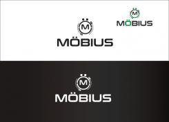
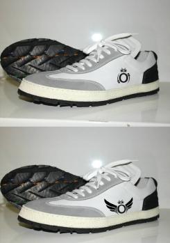
It looks like a super hero or something
Letters form are not what i am looking for
:-)
Very Well Sir!
Let's see if any thing else comes in mind, shall upload it, else you have a full army of designers at your disposal. :-)
No comments
I am not sure about the ¨: it lookks like eyes, so weird. Arrows: not sure as well. Does not look very modern and so
:-) Alright than,
Let's see if something else comes in mind shall design and upload it.
No comments
Hello Sir,
Here is a new design proposal.
Let me know your views.
Kind Creative Regards,
Rusty
Hello,
I think logo is too complex. I want someting very light, with not too many elements
Hi,
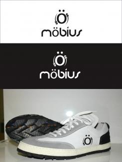
Have made it simple and without many elements,
Have a sneak at the sneaker logo :-)
No comments
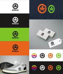
Here is the updated version as per your feedback.
Finally it does not work like this. I don't know what you think about it
Well, it looks nice, just the two dots do not go with it so I had tried to give it some look.
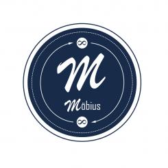
My personal favourite is with the Destortion letter M along with these arrows. And Brand is what we make it ... :-) once the product is liked by masses than even if you use just a circle as your symbol for Logo it will work just fine. :-)
I do agree. I will work with my artistic advisor about all proposals; I think destructured letters can be nice
Very Well Sir,
Once you have finialised and decided what you need, let me know so than I can work further and provide you with presentations of the designs accordingly.
No comments
I want to keep it simple, with no too many information to understand. As below, maybe a Ö with arrows on sides would be sufficient
sure just a moment shall upload it for your visualisation
No comments
Hello Sir,
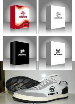
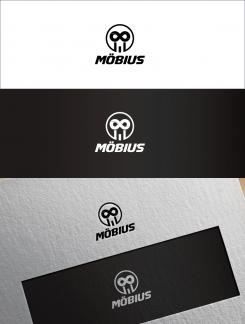
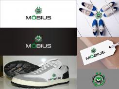
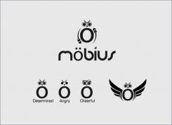
Here is the Developed concept with the Ö monogram with a look of an determined owl. Also have develope the look of the arrows providing them the feel of tire sole along with the motion and recycle concept.
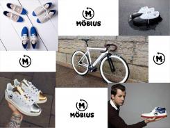
Also have provided a kind of mood board for the monogram developed.
Awaiting your response and feedback,
Kind Creative Regards,
Rusty
Well Rusty, I have to admit that I do not see the link between owl and sneakers. However, I think the idea of Ö with arrows on sides may be interesting as a logo. Maybe there is something to do with it
No comments
I like the idea to have letters "destructured" as your proposal. On the other hand M letters to be used as monogram is maby not the strongest (compare to ö). I think also that arrow is a bit too simple
Very Well,
What do you think about the concept of Mobius strip to be used as monogram. how would like that concept. Like the infinity symbol
I am not sure mobius strip can be used as monogram. I want link with recycling to be very light in this brand. This is the case with arrow you used. But then, maybe you can find a solution using möbius strip as monogram. As I want something strong and differential for monogram I was thinking of using letter Ö that is uncommon
So shall work on your concept of letter Ö as a monogram. what about the destructure style shall I keep it or want something else. And one more thing, I would like to say, I really appreciate that you are communicating about what and how you need. It really helps us design accordingly.
Of course I want to communicate. I would like to do more to give more and more guidelines but I think that designers have great ideas when they are free.
Letter Ö as monogram can be strong, this is my thought. But it may also be too "round" to be used with arrow. Do as you think is the best.
On my side I think arrow concept very interesting; on other hand arrow style is too simple
I like destructured style of letters; I will show it to my artistic advisor today. I also like your 1st proposal of letters (round, pop art style, 70's)
Very Well Sir,
Shall work on the concept and present you with new designs as soon as they are created.
Have a Good Day
Kind Creative Regards,
Rusty
No comments
I like the idea to have letters "destructured" as your proposal. On the other hand M letters to be used as monogram is maby not the strongest (compare to ö). I think also that arrow is a bit too simple
No comments
Typo sympa dans le côté nouveauté, qu'on ne voit pas souvent.
En revanche l'ensemble typo+logo fait très typé marque d'enfant, tout en rondeur, et dessin d'un visage dans le logo
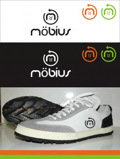
L'idée de la flèche qui tourne est un bon lien pas trop lourd avec le recyclage
Shall improve on and come up with something interesting :-)
Doit améliorer et arriver à quelque chose :-) intéressant
Looks like a bit for a child brand, especially the logo
letters form is interesting, as well as arrow showing an idea of recycling
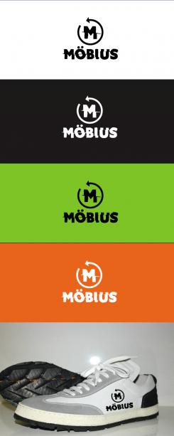
had a concept of letter M developed twisted overall, like we do for plastic bottles before throwing them. shall present it to you
why not
 Nederland
 België
 France
 Deutschland
 Österreich
 United Kingdom
