No comments
new logo for young dog behaviourist
- Contest holder: duko
- Category: Logo & stationery
- Status: Ended
- Files: File 1
Start date: 25-08-2017
Ending date: 01-01-1970
It all started with an idea...
A short, interactive guide helped them discover their design style and clearly captured what they needed.
Brandsupply is a platform where creative professionals and businesses collaborate on unique projects and designs.
Clients looking for a new logo or brand identity describe what they need. Designers can then participate in the project via Brandsupply by submitting one or more designs. In the end, the client chooses the design they like best.
Costs vary depending on the type of project — from €169 for a business or project name to €539 for a complete website. The client decides how much they want to pay for the entire project.
Hello,
I like it a lot im going to discuss it with the people that help me. I have to work today so you will here from me at the end of the day. Greetings duko
Dear Duko, if you have any suggestion to improve my stationery, can you write to my e-mail tennisloool@gmail.com
Since on Brandsupply, designers can put the most 15 works on contest and I reached my limit of 15.
Greetings
hello,
can you explain something about the stationery, because i dont get what is exactly means. what can i change about it? and can you make the circle around the words just a little but i mean i little smaller. but still bigger then the circle from the yin yang. the outher circle is just a little bit to thick i think.
i want this as my logo and then duko sietsema and my data beside it on my car? i need a good stationary for that?
and can you show the logo on a grey background because my car is grey? for easier communication you can email me on duko.sietsema@gmail.com
greetings duko
No comments
What is the difference between the last 2?
Greetings duko
Dear Duko, in the first design i use the same thickness of outer line for line on yin yang in the other is smaller.
Greetings
Dear Duko, in this line is smaller.
Greetings
I think i like the last one the most.
Greetings duko
With the thinner line
Thanks a lot. I will send you a proposal for stationery also. Greetings
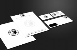
Dear Duko, I have also made proposal for stationery. Greetings
No comments
Its getting close. Can you make the line from the yin yang a little bigger?
Greetings duko
Dear Duko, in the first design i use the same thickness of outer line in the other I'm just a little bit bigger? line on yin yang
No comments
hello,
i do like this design round. another designer put a circle around this i like that really much. only my name is not striking enough. maybe you can do something with it? http://www.brandsupply.nl/wedstrijden/logo_huisstijl/logo-gezocht-voor-startende-hondenpsycholoog-29752/ontwerpen/45144
goodluck
greetings duko
No comments
dear,
thanks for trying but i liked the otherone before this one better. that one is more symmetrical.
greetings duko
No comments
hello,
yes that looks good. can you make hondenpsycholoog slightly bigger and can you put stripes or maybe better dots between duko sietsema and hondenpsycholoog to connect them. the it looks more round.
do you have more ideas and proposals?
kind regards. Duko
maybe you can make duko sietsema bigger so it reaches alto both sides almost in de middle and then make hondenpsycholoog just as big but thinner then duko sietsema. and put left and right dots between them.
then it makes a circle.
greetings duko
No comments
Dear Duko, In this design the line under is thicker. And thank you on reaction. I will work on more proposal.
Greetings
Dear,
thats not really what i meant, i meant under the yin yang logo where the line is attached to the yin yang. from the elipse. i cant wait to see te rest!
greetings duko
Dear Duko, In my new design, both lines are thicker .
Greetings
No comments
can u make the line under the yin yang thicker in this design?
and i placed another reaction on the last post with information to help u out.
i appricate all of your work.
kind regards duko
No comments
hello,
this is in front of duko sietsema. but i liked when the yin yang was attached to the thing around it. so can you do that? or maybe one where the yin yang is slighty higher then duko sietsema. but this one is better then the other forms around it. but other suggestions are still really welcome.
greetings duko
maybe its a good idea to look at other designs on the website for inspiration? kind regards duko
Dear Duko, I was attached logo to the thing around it. What do you think now ?
No comments
hello,
this looks pretty good but can u try to move the yin yang to the front of duko sietsema? and more suggestions on the thing around are always welcome? maybe with a swoosh or stripes around it in the form of a turned square?
greatings duko
Dear Duko, I put the logo on the left and duko sietsema on the right side. Did you mean that? I also worked to show you how it looks like in turned square, hexagon and triangle.
Greatings
https://www.google.nl/url?sa=i&rct=j&q=&esrc=s&source=images&cd;=&cad=rja&uact=8&ved=0ahUKEwjW0bWW5vLVAhWQL1AKHZxsCx4QjRwIBw&url=https://www.logomaker.com/nl/&psig=AFQjCNGnnZfOrKUaRY4BVDXl6ER5g7nIKw&ust=1503764676402793
or
https://www.google.nl/url?sa=i&rct=j&q=&esrc=s&source=images&cd;=&cad=rja&uact=8&ved=0ahUKEwjZ3_z35vLVAhVELFAKHRpgDSoQjRwIBw&url=https://www.pinterest.co.uk/explore/triangle-logo/&psig=AFQjCNGnnZfOrKUaRY4BVDXl6ER5g7nIKw&ust=1503764676402793
or https://www.google.nl/url?sa=i&rct=j&q=&esrc=s&source=images&cd;=&cad=rja&uact=8&ved=0ahUKEwiF3IaN5_LVAhWImLQKHWzICOcQjRwIBw&url=http://www.logosurfer.com/logo/weatherford-international-logo&psig=AFQjCNGnnZfOrKUaRY4BVDXl6ER5g7nIKw&ust=1503764676402793
or like the paramount logo? https://www.google.nl/url?sa=i&rct=j&q=&esrc=s&source=images&cd;=&cad=rja&uact=8&ved=0ahUKEwjE1r755_LVAhWBZlAKHf8VALAQjRwIBw&url=http://www.paramount.com/&psig=AFQjCNGnnZfOrKUaRY4BVDXl6ER5g7nIKw&ust=1503764676402793
u can maybe even try to put duko sietsema and hondenpshycoloog around it but duko sietsema bold and readable ofcourse.
No comments
hello,
that looks a lot better, but more suggestions are welcome!
greatings Duko
Dear Duko, thank you so much, I have more proposal for connection.
Greetings
No comments
Dear Duko, In this proposal the letters are old and I connected logo with duko sietsema. Greetings
hello tennisloool,
i like the thin line great job, the yin yang in the o is not really what i am looking for. i dont want it in the name itsself. i meant like maybe something around it to connect like stripes from small to big in a traingle all around it or just a swoosh. https://www.google.nl/search?biw=1517&bih=735&tbm=isch&sa=1&q=logo&oq=logo&gs_l=psy-ab.3..0i67k1l4.50458.52517.0.52762.18.10.0.0.0.0.76.518.9.9.0....0...1.1.64.psy-ab..13.4.237.0..0.tropFJ4CtU0#imgrc=Lh28SfsovlTWKM:
or like this https://www.google.nl/url?sa=i&rct=j&q=&esrc=s&source=images&cd;=&cad=rja&uact=8&ved=0ahUKEwiI4pSLxvLVAhUPa1AKHS_jDhcQjRwIBw&url=https://en.wikipedia.org/wiki/File:Kaohsiung_Mass_Rapid_Transit_Logo(Logo_Only).svg&psig=AFQjCNEivWbPa8gZ39IRDeAA2OceVmP1Uw&ust=1503755858599780
No comments
Dear Duko, thanks for your comment. I worked on your suggestions the hondenpsycholoog is now thinner and lenght as duko sietsema . What do you think by this idea for a connection?
Greetings
hello, thats actually not what i meant but it is a great idea. can y try to make a thin line between duko sietsema and hondenpsycholoog?
what i meant was, how can we make duko sietsema and the yin yang more connected?
No comments
Dear Duko, I used your explanation and image you set up to create a logo. Do you have any suggestions to improve my work? Greetings
hello,
yes i have some suggestions, can u make hondenpsycholoog the same lenght as duko sietsema and can u make it a bit thinner. and do you have some ideas to make it more connected to each other.
greetings duko
hello,
yes i have some suggestions, can u make hondenpsycholoog the same lenght as duko sietsema and can u make it a bit thinner. and do you have some ideas to make it more connected to each other.
greetings duko
 Nederland
 België
 France
 Deutschland
 Österreich
 United Kingdom
