No comments
The Modern Tea Brand: minimalistic, modern, social tea brand
- Contest holder: casparsmits
- Category: Logo & stationery
- Status: Ended
Start date: 01-05-2018
Ending date: 15-05-2018
It all started with an idea...
A short, interactive guide helped them discover their design style and clearly captured what they needed.
Brandsupply is a platform where creative professionals and businesses collaborate on unique projects and designs.
Clients looking for a new logo or brand identity describe what they need. Designers can then participate in the project via Brandsupply by submitting one or more designs. In the end, the client chooses the design they like best.
Costs vary depending on the type of project — from €169 for a business or project name to €539 for a complete website. The client decides how much they want to pay for the entire project.
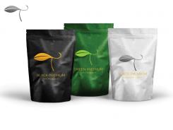
Compared to the other leaf design you posted, I like this one a lot better. Shows quality, but is a bit less minimalistic. Do you think you could make it more minimalistic?
No comments
Hi Artistika,
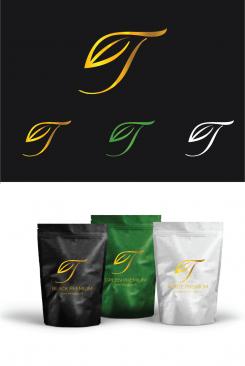
Could you add both the type of tea (like Golden Needles) and the Modern Tea Brand to the packaging? We really liked how you displayed the type of tea in your previous post, with the three cans in a row (Black, white and green tea) and would like to see how that looks with the The Modern Tea Brand added to it.
From your these designs, we like the one you chose to show on the packaging (number 1 or 7).
Best,
Caspar
No comments
Do you have a proposal on how we could use "The modern tea brand", the type tea and the logotype on the packaging?
So we might be asking something very difficult: the logotype is minimalistic and symbolic, but not very modern. Do you think there is a way to combine all three?
Hey artistika,
We've been discussing the logo's and my previous question might not be a good direction (to make the logotype more modern). The elegance expresses Excellence while still being minimalistic and that might be enough. Both me and my teammate voted your design as our favorite so far.
I definitely like to see it with "the Modern Tea Brand" label on the packaging, to see if it can maintain its modernity (is that a word?) with more info on it. We'd also like to see more color combinations for the different types of tea. I'm very curious what you come up with.
Best,
Caspar
No comments
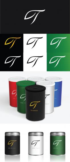
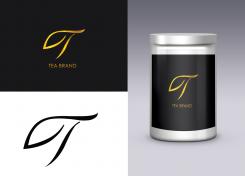
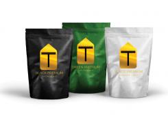
This one looks quite minimalistic. Do you have any further ideas about how the (other) tin cans could look like (color wise, and design-wise)?
No comments
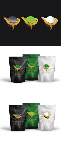
I really like how you used a T-pot. We would like to see a more 'flat' version of this, that is a bit more minimalistic. Feel free to use any background / tin package you'd like, the packages we suggested before don't do your designs justice.
No comments
In combination with the teabag I think it's not minimalistic enough, the gradients are a bit much.
No comments
We communicated this poorly before, but we aren't using this packaging. We will be using tin cans. Also, feel free to use any colors you'd like.
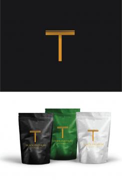
About your work: we really like the level of minimalism on this one, but miss a reference to tea in it.
 Nederland
 België
 France
 Deutschland
 Österreich
 United Kingdom
