No comments
It all started with an idea...
A short, interactive guide helped them discover their design style and clearly captured what they needed.
Brandsupply is a platform where creative professionals and businesses collaborate on unique projects and designs.
Clients looking for a new logo or brand identity describe what they need. Designers can then participate in the project via Brandsupply by submitting one or more designs. In the end, the client chooses the design they like best.
Costs vary depending on the type of project — from €169 for a business or project name to €539 for a complete website. The client decides how much they want to pay for the entire project.
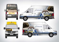
hopefully can be in accordance with what you want
The back of the van is not bad, but I do not like the front. Can you make something with just a photo on the back of the van, and use dark gray on the sides?
need your feedback sir
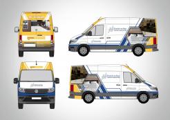
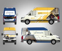
I like your idea. but I think it's a bit over the top. Can you make something with a little less yellow and blue? The first idea that I had in my head was to make the two sides with the PB logo, and the back with keukenhelmond. And then create a transition from PB-logo (blue) to keukenhelmond (yellow) for example by a photo (s), or / and the use of antreciet gray (dark gray). Anyway, you are the most creative designer until now... Thank you
I like your idea. but I think it's a bit over the top. Can you make something with a little less yellow and blue? The first idea that I had in my head was to make the two sides with the PB logo, and the back with keukenhelmond. And then create a transition from PB-logo (blue) to keukenhelmond (yellow) for example by a photo (s), or / and the use of antreciet gray (dark gray). Anyway, you are the most creative designer until now... Thank you
I like your idea. but I think it's a bit over the top. Can you make something with a little less yellow and blue? The first idea that I had in my head was to make the two sides with the PB logo, and the back with keukenhelmond. And then create a transition from PB-logo (blue) to keukenhelmond (yellow) for example by a photo (s), or / and the use of antreciet gray (dark gray). Anyway, you are the most creative designer until now... Thank you
oke i'll do my best sir... thanks for your attention
 Nederland
 België
 France
 Deutschland
 Österreich
 United Kingdom


