 Nederland
 België
 France
 Deutschland
 Österreich
 United Kingdom
No comments
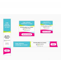
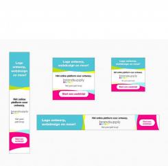
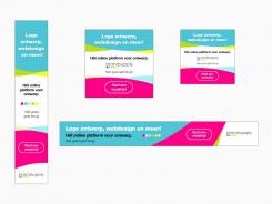
Design the new Brandsupply banner
- Contest holder: Brandsupply NL
- Category: Banner
- Status: Ended
- Files: File 1, File 2, File 3
Start date: 18-06-2014
Ending date: 09-07-2014
Total budget: € 359.00
Latest design
It all started with an idea...
A short, interactive guide helped them discover their design style and clearly captured what they needed.
Brandsupply is a platform where creative professionals and businesses collaborate on unique projects and designs.
Clients looking for a new logo or brand identity describe what they need. Designers can then participate in the project via Brandsupply by submitting one or more designs. In the end, the client chooses the design they like best.
Costs vary depending on the type of project — from €169 for a business or project name to €539 for a complete website. The client decides how much they want to pay for the entire project.
Designer:
 St.Brandsupply
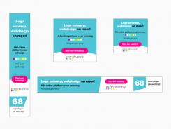
68 inzendingen laten staan? Meende dat dat belangrijk was als ik het briefing/commentaar goed las
This contest is finished. Its not possible to reply anymore.
No comments
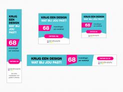
Naar mijn idee moet je je onderscheiden met kleuren, wit valt weg in een website waarop je adverteert.
Dank voor de update. Het kleurgebruik is leuk gevonden. De tekst van het vorige ontwerp vonden we echter sterker.
This contest is finished. Its not possible to reply anymore.
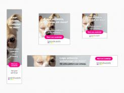
Nog wel 1 idee, minder sterk dan de eerste is deze variant. Puur als eye-catcher > afbeelding.
We hebben helaas niet echt beeldmateriaal dat wij direct vinden aansluiten bij ons concept, al ziet het leaderboard er best aardig uit.
This contest is finished. Its not possible to reply anymore.
in ieder geval even de verbetering van de vorige > button positie
Dank, dit ziet er al beter uit (telt als 3,5 ster) ;)
This contest is finished. Its not possible to reply anymore.
Hier de aangepaste variant
Dank voor de update. De knop komt er nu idd beter uit, al is het wederom bij het vierkante exemplaar iets minder in verhouding. We zouden het mooier vinden als de knop ook hier in 1 kleurvak zou zitten. Daarnaast zouden we ook graag een andere richting zien; verras ons.
Graag gedaan. Als de knop geheel gevuld wordt krijg je last met jullie eerder opmerking 'de verhoudingen lijken niet helemaal te kloppen. Ik zal kijken of ik dit naar boven kan krijgen ten koste van de witruimte.
Wat betreft een andere opzet, als ik een andere opzet maak zou dat betekenen dat ik hier niet achter kan staan. Ik sta achter dit ontwerp, een betere weet ik zo even niet gezien jullie huisstijl.
This contest is finished. Its not possible to reply anymore.
No comments
Dank voor de inzending. Goed begin, de teksten vinden we sterk. De knop vinden we een beetje wegvallen in dit ontwerp en de verhoudingen lijken niet helemaal te kloppen. Graag zouden we nog een andere banner van jou zien.
Thanks, gaan we doen. Alleen 'verhoudingen kloppen niet' begrijp ik niet. Heb de maten aangehouden van de banners zoals genoemd.
Daarbij kwam dat ik op dit moment een huisstijllijn mis van brandsupply. Moet ik me nog ergens aan vast houden? Zo nu ook het gebruik van alle kleuren, het lift gebruik ik 2 tot 3 kleuren ipv alle 5 of 6. Kunnen jullie wat sturen of info laten zien van huidige uitingen ivm consistentie?
thanks again
het lift gebruik = het liefst gebruik ik (jullie chat komt telkens @#$ in beeld onder het typen:) )
Beetje onduidelijk van mijn kant inderdaad, ik bedoelde de balans tussen de verschillende vlakken in de banner. Bij het vierkant bijvoorbeeld wordt het roze vlak erg groot. Als richtlijn kun je de site en het logo aanhouden, verder ben je vrij dit zelf in te vullen, succes.
This contest is finished. Its not possible to reply anymore.