 Nederland
 België
 France
 Deutschland
 Österreich
 United Kingdom
Boje su odabrane u skladu sa zahtevima klijenta-plava kao dominantna na logou i vizitkartama (prednja i zadnja strana). Mašnu na knjigama sam nacrtala tako da simbolizuje dva slova R koja su u nazivu klijentovog sajta - mašna bi trebalo da doprinese veselosti i vedrini, ali je ipak minimalna i elegantna, iako je reč o knjigama za decu. Ukoliko Vam se osnovna ideja dopada, spremna sam da poradim na izmenama i korekcijama.
Cool logo and business card for a trendy book site for kids!
- Contest holder: jonathan.bailie 1
- Category: Business card
- Status: Ended
Start date: 07-03-2016
Ending date: 14-03-2016
Total budget: € 179.00
Latest design

It all started with an idea...
A short, interactive guide helped them discover their design style and clearly captured what they needed.
Brandsupply is a platform where creative professionals and businesses collaborate on unique projects and designs.
Clients looking for a new logo or brand identity describe what they need. Designers can then participate in the project via Brandsupply by submitting one or more designs. In the end, the client chooses the design they like best.
Costs vary depending on the type of project — from €169 for a business or project name to €539 for a complete website. The client decides how much they want to pay for the entire project.
Designer:
 bravica
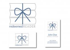
The colors have been chosen in accordance with client's requests - blue as predominant color on logo and business cards (front and back). The bow is drawn so that it symbolizes two letters "R" that are contained in the name of client's website. The bow is supposed to contribute to cheerfulness but still remains minimal and elegant at the same time. If you like the idea, I am ready to work on any necessary changes and corrections.
This contest is finished. Its not possible to reply anymore.
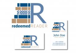
Logo i vizit karte (prednja i zadnja strana) su u skladu sa bojama koje je klijent zahtevao, tačkasta knjiga simbolizuje zabavnu, dečju literatutu koja se razlikuje od "ozbiljnih" knjiga za odrasle, a može asocirati i na knjigu koja je upakovana kao poklon. Slovo R je dominantno, pošto se dva puta pojavljuje u nazivu sajta. Naravno, ukoliko je osnovna ideja prihvatljiva, mogu uneti bilo kakve potrebne korekcije.
Logo and business cards (front and back) are created in accordance with client's color choice and the dotted book symbolizes fun, children's literature which differs from serious books for adult readers. It can also be related to a book that is wrapped in paper as a gift. The letter R is predominant since it appears twice in the title of the website, Of course, if you like basic idea, I am willing to make any necessary changes and alterations.
This contest is finished. Its not possible to reply anymore.