 Nederland
 België
 France
 Deutschland
 Österreich
 United Kingdom
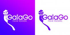
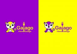
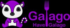
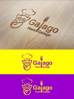
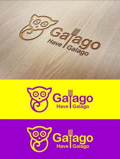
GalaGo
Designers Champions League design for start up
- Contest holder: GalaGo
- Category: Business card
- Status: Ended
- Files: File 1
Start date: 02-12-2021
Ending date: 09-12-2021
Total budget: € 369.00
Latest design
It all started with an idea...
A short, interactive guide helped them discover their design style and clearly captured what they needed.
Brandsupply is a platform where creative professionals and businesses collaborate on unique projects and designs.
Clients looking for a new logo or brand identity describe what they need. Designers can then participate in the project via Brandsupply by submitting one or more designs. In the end, the client chooses the design they like best.
Costs vary depending on the type of project — from €169 for a business or project name to €539 for a complete website. The client decides how much they want to pay for the entire project.
Designer:
 DD TOPENG
This contest is finished. Its not possible to reply anymore.
galago
This contest is finished. Its not possible to reply anymore.
galago
This contest is finished. Its not possible to reply anymore.
GalaGo
This contest is finished. Its not possible to reply anymore.
GalaGo
This contest is finished. Its not possible to reply anymore.
Galago
This contest is finished. Its not possible to reply anymore.
GalaGo
This contest is finished. Its not possible to reply anymore.
Galago
This contest is finished. Its not possible to reply anymore.
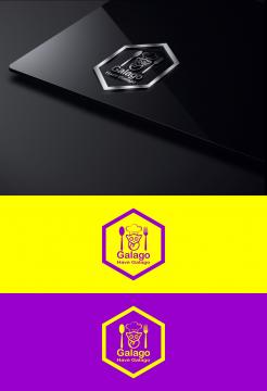
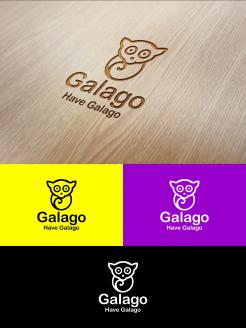
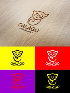
GALAGO
We think the tail is too predominant, the other Galago you used is more basic and recognizable as well. Focus on that one. What we do like about this one is the fact that the letter 'G' in GalaGo is capital or somehow recognizable as mentioned in previous feedback. Yet, we advise you to focus on the other logo you have designer for us. Good luck.
This contest is finished. Its not possible to reply anymore.

GalaGo
This contest is finished. Its not possible to reply anymore.
GalaGo
This contest is finished. Its not possible to reply anymore.
GalaGo
This contest is finished. Its not possible to reply anymore.
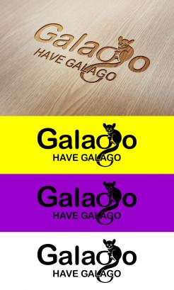
GalaGo
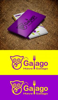
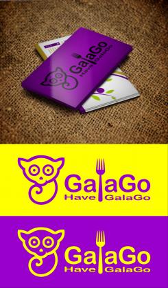
Receiving written feedback makes your design among the better ones submitted so far. Yet, this is Champions League and we look for the Ronaldo in your designer skills.
We are ambitious and looking for this little extra that makes it basic, recognizable, yet differ itself from any other company that may call itself GalaGo already or might do so in future. Judging by the time you managed to design this, we are confident you will have even more capacity in you to do so. Compliments for designing the cuteness factor we are looking for, the heart-shaped nose that is turned does it; cute but not too cute.
Furthermore, we understand that what we are going to ask you for is complicated since the name is missing any link with the subject, but we are somewhat missing a link with food in all logos so far. It somewhat looks you have been struggling with finalizing the tail and where and how to end it. Possibly, you could use anything related to food in doing so. We will welcome all personal input and inspiration from your side, but will give you the same free tip as we have given someone else; don't use all capital letters since the company is called GalaGo with reason. The letter 'l' in GalaGo could be turned into a subtle fork for example. Don't worry too much about the colours, we like the black and yellow in these designs and could always turn it into white and purple if we decide otherwise. We will look through it, just make sure you keep focus on the logo itself.
Good luck, you have good cards so far. Impress us and show us what differs you from the other good designs submitted so far.
This contest is finished. Its not possible to reply anymore.