 Nederland
 België
 France
 Deutschland
 Österreich
 United Kingdom
teil 2
Flyer design or rework of our tinned food flyers
- Contest holder: metzgerei27
- Category: Flyer, tickets
- Status: Ended
Start date: 08-10-2014
Ending date: 30-11-2014
Total budget: € 249.00
Latest design
It all started with an idea...
A short, interactive guide helped them discover their design style and clearly captured what they needed.
Brandsupply is a platform where creative professionals and businesses collaborate on unique projects and designs.
Clients looking for a new logo or brand identity describe what they need. Designers can then participate in the project via Brandsupply by submitting one or more designs. In the end, the client chooses the design they like best.
Costs vary depending on the type of project — from €169 for a business or project name to €539 for a complete website. The client decides how much they want to pay for the entire project.
Designer:
 kathrin1994
schon besser, aber irgendwie fehlt mir da noch was
This contest is finished. Its not possible to reply anymore.
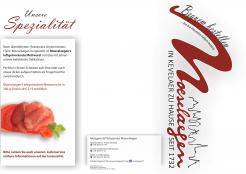
ich habe den hintergrund des flyers angepasst, sodass es nicht mehr so düster wirkt - Sie hatten recht, so erhält er viel mehr Klarheit und auch Modernität
This contest is finished. Its not possible to reply anymore.
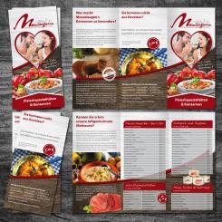
Flyer im Stile der Corporate Identity - Außenseite
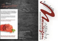
hm, sehr düster um nicht zu sagen depressiv. die eingekürzten texte hingegen gefallen mir gut
This contest is finished. Its not possible to reply anymore.
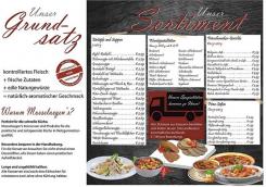
Flyer im Stile der Corporate Identity - Innenseite
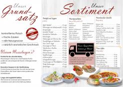
Ich habe beim Flyer bewusst auf lange, ausführliche Texte verzichtet. Zudem habe ich bei den Grundsätzen auf einen weißen Hintergrund gesetzt, da die Farbe auf den Endverbraucher psychologisch mit einem positiven Image verbunden wird.
This contest is finished. Its not possible to reply anymore.