 Nederland
 België
 France
 Deutschland
 Österreich
 United Kingdom
No comments
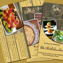
Advertising flyer / brochure for cake company
- Contest holder: mokisgoodies
- Category: Flyer, tickets
- Status: Ended
- Files: File 1, File 2
Start date: 29-07-2013
Ending date: 29-08-2013
Total budget: € 249.00
Latest design
It all started with an idea...
A short, interactive guide helped them discover their design style and clearly captured what they needed.
Brandsupply is a platform where creative professionals and businesses collaborate on unique projects and designs.
Clients looking for a new logo or brand identity describe what they need. Designers can then participate in the project via Brandsupply by submitting one or more designs. In the end, the client chooses the design they like best.
Costs vary depending on the type of project — from €169 for a business or project name to €539 for a complete website. The client decides how much they want to pay for the entire project.
Designer:
 Maarti Pictures
Hi Monika, I've tried to make changes as you've suggested, further changes are not a problem.
Best regards,
Martina @Maarti Pictures
This contest is finished. Its not possible to reply anymore.
No comments
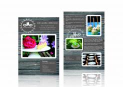
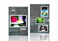
thanks a lot. the front looks better now :-)
in the text box with the address: i imagine it could bring some tranquility in the front, if the title "Kontakt" is without the white frame, but in the same size and style as the header on top "mokis.goodies | delikat.essen".
the second white framed header could be deleted then.
On the back: could you divide the text box in two parts? maybe one on the bottom on the right?
thanks & best regards,
monika
This contest is finished. Its not possible to reply anymore.
No comments
Hi, thanks for the design. Is it supposed to be in A5 Size?
In the description I attached 2 files with the text that is needed in the flyer.
Could you add it & show how the flyer would look like inside?
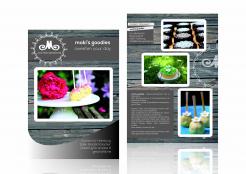
I like the design. On the first page I think that the "curve"thing on the bottom is too much. Maybe the "wood" looks better without this cover or it should be a bit more transparent?
Thank you very much & best regards,
Monika
Hi Monika, I will try to make these changes (use your text and adjust or remove the curve). Indeed I've meant the format to be A5.
Best regards,
Martina @Maarti Pictures
This contest is finished. Its not possible to reply anymore.