 Nederland
 België
 France
 Deutschland
 Österreich
 United Kingdom
No comments
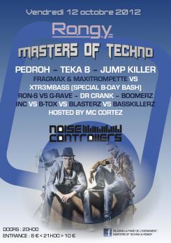
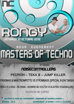
FLYER TECHNO FESTIVAL
- Contest holder: seb128
- Category: Flyer, tickets
- Status: Ended
- Files: File 1
Start date: 06-06-2012
Ending date: 26-06-2012
Total budget: € 150.00
Latest design
It all started with an idea...
A short, interactive guide helped them discover their design style and clearly captured what they needed.
Brandsupply is a platform where creative professionals and businesses collaborate on unique projects and designs.
Clients looking for a new logo or brand identity describe what they need. Designers can then participate in the project via Brandsupply by submitting one or more designs. In the end, the client chooses the design they like best.
Costs vary depending on the type of project — from €169 for a business or project name to €539 for a complete website. The client decides how much they want to pay for the entire project.
Designer:
 Leepo_D
Thank you ! Super progress ! Much better ! :D
We will let the comittee of the organisation of the party choose and vote at the end of the contest ! Thank you !
Ok!!! Thank you!!! :)
This contest is finished. Its not possible to reply anymore.
No comments
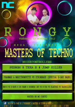
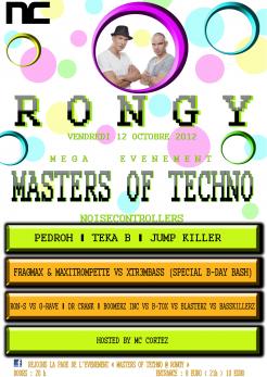
Hello and thank you for those two samples.
Between your two first tries, we prefer that one "the balck one". But to be honnest, we do not like the atmosphere. It is a bit to crowded: too much different forms and colors ... And the writing are a bit weird: it is hard to read it (mostly in the bottom with the green rectangles).
However, the idea of the "NC picture" in a bubble is funny ! And the blowing bubbles pictures in the background may be great if you down it a bit... !
Thank you again and see you soon !
ok, tnx for suggestion!!! :)
This contest is finished. Its not possible to reply anymore.
No comments
This contest is finished. Its not possible to reply anymore.