Dear Yevhen,
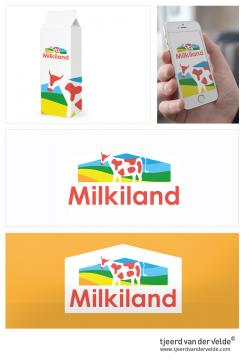
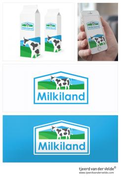
Here are some versions that should speak to you the most (based to your comments) We can always change the colorscheme or details, even after the competition. I hope i can inspire you with one of them!
Redesign of the logo Milkiland. See the logo www.milkiland.nl"
- Contest holder: Yevhen
- Category: Logo design
- Status: Ended
Start date: 27-03-2014
Ending date: 25-04-2014
It all started with an idea...
A short, interactive guide helped them discover their design style and clearly captured what they needed.
Brandsupply is a platform where creative professionals and businesses collaborate on unique projects and designs.
Clients looking for a new logo or brand identity describe what they need. Designers can then participate in the project via Brandsupply by submitting one or more designs. In the end, the client chooses the design they like best.
Costs vary depending on the type of project — from €169 for a business or project name to €539 for a complete website. The client decides how much they want to pay for the entire project.
thanks we'll think of it
I also made these versions, with a dark blue is leading color...
I see, I like it
The light blue is better
Some subtle changes, and two colorschemes
hELLO
WHRE IS THE OUTLINE? If we have not a white background, we need an outline
Yevhen
I can bring back the outline, it's also possible to place it in a white box, like my previous upload. This way the logo works on every background and it's more modern.
which colorscheme do you prefer?
It's hard to say which color scheme is better. Maybe blu one.
The logo has to get its' margines I beleive.
in a different color scheme, with a modern feel to it..
Milkiland, pure freshness! This asks for a modern logo, that fits different media. The brand design works perfect in large and small scale and is useable on different products/ fabrics. I hope i can inspire you with my design!
Friendly regards,
Tjeerd van der Velde
Hello,
it is just simple, not bad at all, but milky.
There is no premiality in colors, not a hint of cheese or other dairy cheese.
Hochland is our example.
They don't draw cheese but they look premium
Yevhen
Hello,
it is just simple, not bad at all, but milky.
There is no premiality in colors, not a hint of cheese or other dairy cheese.
Hochland is our example.
They don't draw cheese but they look premium
Yevhen
Thank you for your comments, i will make adjustments so the logo fits the description better..
that is one of the best for the moment still
 Nederland
 België
 France
 Deutschland
 Österreich
 United Kingdom
