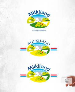
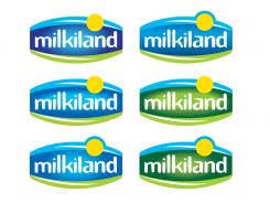
Hello Yevhen,
Next variations, blue and also tried with green.
Greetings
Redesign of the logo Milkiland. See the logo www.milkiland.nl"
- Contest holder: Yevhen
- Category: Logo design
- Status: Ended
Start date: 27-03-2014
Ending date: 25-04-2014
It all started with an idea...
A short, interactive guide helped them discover their design style and clearly captured what they needed.
Brandsupply is a platform where creative professionals and businesses collaborate on unique projects and designs.
Clients looking for a new logo or brand identity describe what they need. Designers can then participate in the project via Brandsupply by submitting one or more designs. In the end, the client chooses the design they like best.
Costs vary depending on the type of project — from €169 for a business or project name to €539 for a complete website. The client decides how much they want to pay for the entire project.
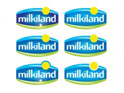
Hello Yevhen,
Variations with more brightness, color changes to make the logo more vivid.
Greetings
PS This is my upload 15, the max upload Brandsupply allows
So this was the last upload.
We did not like to have that white spot (star or smth) at the bottom part. You can't remove it now.
Anyway it was my pleasure to communicate with you.
Let's wait for results
Thank you
Yevhen
Hello Yevhen,
If you remove the stars from the uploads you did not comment on I can remove that design and maybe upload a new one. Also after the contest i can remove the white spot.
Regards
Let's remove 1 of the ealier version and upload a new one.
Please work with left darker versions.
Could you please try to chang the main blue color and maybe green to brighter tones?
Please compare the version with our competitors - Valio, Hochland, Arla, Milkana, Frico, President.
We should be as bright as they are.
The logos of the competitors are available here.
http://www.ex.ua/136742679474
or https://drive.google.com/file/d/0B3ra5RoWe4H1T1ducktpd2dMWGM/edit?usp=sharing
Yevhen
Hello Yevhen,
First you have to remove the stars (if it is possible) on the logo's you did NOT comment on.
Hopefully I can delete that design, so I can upload another one.
Peter
Hello Peter,
i removed the stars from the versions withouta comments. Look forward to get from you some fresh visions
Have you the possibility to communicate after the contest7
my mail is: y.mulyarchuk@1inc.kiev.ua
Yevhen
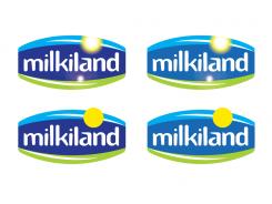
Logo with a yellow dot, like a sun. Two with sunrays and two without the sunrays.
Thank you. We are going to thinnk of it
Hello
I'm talking about the lower line (full yellow sun).
I would ask you to add brightness to your concept.
Please, look at Valio brand logo or Milchland Niedersachsen, Arla. They are more vivid, catchy.
Yevhen
Ok. back to... With shape en color variations.
Ok, we will thonk of it
Thanks.
And some cleaner in different color variations
Hello
I see you have changed the font, but we top blue and bottom grenn has been lost. i'm not shure that it is better
Yevhen
Vignet with more white background
Maybe loose the 'flare' in this one...
that is better
Just another idea... Maybe to modern for Ukraine, Russia, Asia?
Good idea. would you mind to add an outline - red, yelolow, orange line to have a margine of the logo?
Thanks
And a second one with the other type. The one I used in the first proposal.
"Milkilnd" is better not in white ink
"Milkilnd" is better not in white ink
"Milkiland" is better not in white ink
although white Milkiland but it is one of the best for the moment. Please take the second where the star is below for your future thinking
Hello,
Could you please take an upper logo and put instead of that speck or patch of light above the "milkiland" something like a sun.
The sun could be big enough to stick out of the margings of the logo.
Thanks
Yevhen
No comments
Hello Yevhen,
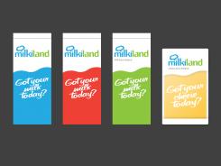
You are right. The first one was to milky. Here is another idea for Milkiland.
Regards,
Millsend
No comments
Of 'Got your daily milk?' en 'Got your daily cheese?' kan ook.
Vriendelijke groet,
Millsend
Nice and milky, not about cheese though. Lack of an outline. Needs margines for using it on different packages.
Thanks
We got milk not under that brand. that is more for cheese at the moment, milk in the future could also be.
For milk your logo is perfect
Please look at the logo of Hochland brand as our competitor
 Nederland
 België
 France
 Deutschland
 Österreich
 United Kingdom
