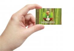
I'm sorry. Previous design was with only 3 stars, and you have 4. Changed that and added some more presentations.
Hotel Nature & Spa ****
- Contest holder: nature&spa
- Category: Logo design
- Status: Ended
Start date: 19-04-2014
Ending date: 29-04-2014
It all started with an idea...
A short, interactive guide helped them discover their design style and clearly captured what they needed.
Brandsupply is a platform where creative professionals and businesses collaborate on unique projects and designs.
Clients looking for a new logo or brand identity describe what they need. Designers can then participate in the project via Brandsupply by submitting one or more designs. In the end, the client chooses the design they like best.
Costs vary depending on the type of project — from €169 for a business or project name to €539 for a complete website. The client decides how much they want to pay for the entire project.
- Bien qu'elle soit bien réfléchie, nous n'aimons pas trop l'image.
- Nature&spa; est trop collé à "E&S"
- L'ensemble est harmonieux.
My French is heavily dependable on google translate, so if you don't mind, please write comments in English. :) What does E&S stand for?
And what would you like me to change in the picture? Is it too simplified? Colors are wrong?
Although it is well thought out, we do not really like the picture.
- Nature &spa; is too stuck in "E & S"
- All is harmonious.
Hi! Here's my submission. Hope you like it. I was going for extremely clean and elegant logo. Shiny jing-jang made of leaf and a drop of water with rich typeface gives it a feel of extremely high service (world class level). Should remind that number of stars on actual logo depends on your actual classification, and shoul be in correspondence with that. Also, the "slogan" should not be used everywhere. Any feedback would be much appreciated!
Merci pour les efforts sur différents visuels.
Thank you for the efforts of different visual.
**** et non *** par contre
 Nederland
 België
 France
 Deutschland
 Österreich
 United Kingdom


