Hi,
Here's another design...
Logo Re - Design / Makeover / New design for a new restaurant concept
- Contest holder: metzgerei27
- Category: Logo design
- Status: Ended
Start date: 19-09-2014
Ending date: 13-10-2014
It all started with an idea...
A short, interactive guide helped them discover their design style and clearly captured what they needed.
Brandsupply is a platform where creative professionals and businesses collaborate on unique projects and designs.
Clients looking for a new logo or brand identity describe what they need. Designers can then participate in the project via Brandsupply by submitting one or more designs. In the end, the client chooses the design they like best.
Costs vary depending on the type of project — from €169 for a business or project name to €539 for a complete website. The client decides how much they want to pay for the entire project.
not bad either, however I did like your other entries better
Well, i've done 2 different ones... one with and one without shadow behind the white fork, knife and logo :)
at this point, definetly within the top 5
Like this ? :)
Kind regards...
Oliver
well, I'd say make it all white, forget about the checked pattern on the apron, the arms, shirt, plate and so on, no red details whatsoever; just all plain white
No comments
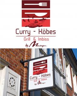
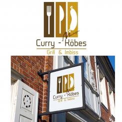
what if... we would just silhoutte the Köbes guy...? that might be worth a shot
so that you basically just got the köbes outline, forget about the inner details... white fork, white knife, white köbes silhoutte
And another variation... :)
Kind regards
Oliver
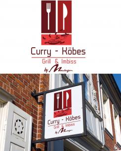
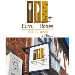
Here's one with the köbes figure rotated 90°
and the Moeselaegen logo bigger.
Hi,
Here's one with the requested changes.
Hope you like it.
Kind regards,
Oliver
lovely, the Moeselaegen Logo could be bit bigger. but then the Köbes-Figure looks kind of lost. would it be an option to rotate it by 90°, so that it's basically aligned with fork and knife?
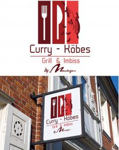
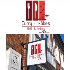
And also one in red colours...
Kind regards,
Oliver
really nice, as far as colors go. the Moeselaegen Logo could be bit bigger. but then the Köbes-Figure looks kind of lost. would it be an option to rotate it by 90°, so that it's basically aligned with fork and knife?
No comments
Hi,
Here's a first attempt for your logo...
Colors and fonts can be changed any time.
Feedback is more than welcome,
Kind regards,
Oliver
wow, I really do like your style. can you somehow implement our 'Köbes' figure? maybe bringo the Moeselaegen - Logo to the real bottom, below Grill & Imbiss and add 'by'
Grill & Imbiss
by Moeselaegen
Thank you so much for your kind words... and the stars... I'll make the logo with the requested changes...
Kind regards,
Oliver
 Nederland
 België
 France
 Deutschland
 Österreich
 United Kingdom
