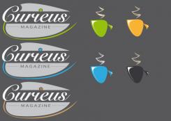
The logo use color'scheme.
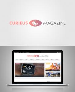
Why an eye ?
the logo is caracterized by an eye to symbolize the curiosity to view and read a blog.
Why the cup of coffee ?
To symbolized the break to read the blog.
The calm and serenity about the break time.
And the colors ?
The colors use a gradient to symbolise the feminity and the blog's modernity.
In resume, the logo is clean, modern and create for women.
(sorry for my bad english :-) )
Logo for an online magazine
- Contest holder: Curieus Magazine
- Category: Logo design
- Status: Ended
Start date: 14-11-2014
Ending date: 28-11-2014
It all started with an idea...
A short, interactive guide helped them discover their design style and clearly captured what they needed.
Brandsupply is a platform where creative professionals and businesses collaborate on unique projects and designs.
Clients looking for a new logo or brand identity describe what they need. Designers can then participate in the project via Brandsupply by submitting one or more designs. In the end, the client chooses the design they like best.
Costs vary depending on the type of project — from €169 for a business or project name to €539 for a complete website. The client decides how much they want to pay for the entire project.
 Nederland
 België
 France
 Deutschland
 Österreich
 United Kingdom

