No comments
Develop a logo for a new business in the food sector
- Contest holder: jordy&arnel
- Category: Logo design
- Status: Ended
Start date: 11-02-2015
Ending date: 17-04-2015
It all started with an idea...
A short, interactive guide helped them discover their design style and clearly captured what they needed.
Brandsupply is a platform where creative professionals and businesses collaborate on unique projects and designs.
Clients looking for a new logo or brand identity describe what they need. Designers can then participate in the project via Brandsupply by submitting one or more designs. In the end, the client chooses the design they like best.
Costs vary depending on the type of project — from €169 for a business or project name to €539 for a complete website. The client decides how much they want to pay for the entire project.
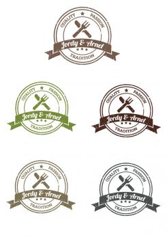
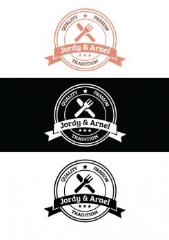
Did you have something like this in mind? I also experimented with some colors, and would like to hear what do you think.
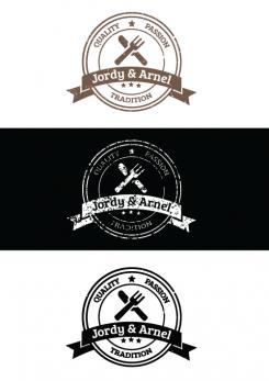
This is little changed version of first logo. Now it has little stamp look and some stars are smaller. If youy hace any suggestion please say.
Still liking the design! Is there anyway you can give this logo al bit more of a "oldfashioned" look? Maybe by changing the type of letters?
for example the type you used in the other logo
No comments
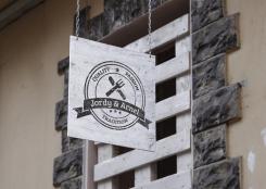
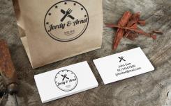
Good day! Based on your instructions, I tried to present the logo in a little old-fashioned environment. Also the logo has a couple of changes from the original version, which you can see in the following attached work. Any proposal for changing the logo, colors, is welcome :)
 Nederland
 België
 France
 Deutschland
 Österreich
 United Kingdom
