No comments
Make me famous. Design a simple logo for a personal brand.
- Contest holder: patrickklerks
- Category: Logo design
- Status: Ended
Start date: 17-06-2012
Ending date: 01-07-2012
It all started with an idea...
A short, interactive guide helped them discover their design style and clearly captured what they needed.
Brandsupply is a platform where creative professionals and businesses collaborate on unique projects and designs.
Clients looking for a new logo or brand identity describe what they need. Designers can then participate in the project via Brandsupply by submitting one or more designs. In the end, the client chooses the design they like best.
Costs vary depending on the type of project — from €169 for a business or project name to €539 for a complete website. The client decides how much they want to pay for the entire project.
No comments
I don't really recognize what the logo stands for. Is there a meaning/explanation?
no meaning..but it looks nice :D
It does ;)
You can send me a Photo from you... And i Take a Profil like the symbol... over the written Part :)
Hahaha, that should be fun. Not sure if it will work, because I have a tendency of changing my looks, but who knows. What e-mail should I send it to?
mister_kaydee@hotmail.de
No comments
I speak a little german, so if you reply in german I can easily understand you. I'll reply in english, if you don't mind ;)
I like this version the best. Really nice.
THX :) if you want other colors or something else... TELL ME PLS !!
I'm going to add this to my favorites list and show it to some friends. I will get back to you with some final remarks before july 1st! Thanks again.
No comments
See other logo for feedback.
No comments
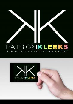
Nice! (Don't know if you're dutch or not, so I'll do this in english). I like the color scheme and the inverted 'K'. I think the separating line in between the inverted K and the regular K looks a bit too much like a capital "i", so could you remove it, or change it into something else? It kind of looks like it says PATRICKIKLERKS, which might be confusing.
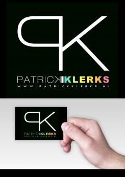
Also, I'm not a huge fan of typographic logo's. Ik think the PK logo is nicely done, but perhaps you could substitute it with a graphic logo, like they've done here: http://logopond.com/gallery/detail/114546 (obviously, I'm not looking for a copy of their logo, it should be something that kind of corresponds with the characteristics in my briefing).
Nevertheless, the bottom part already looks very cool!
 Nederland
 België
 France
 Deutschland
 Österreich
 United Kingdom
