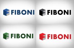
The geometric-like shapes stand for the connection Fiboni has between it's fields of expertise and interests. It has the intension to generate the feeling for astronomy and science, art, culture and life style.
It's design is made to be symplistic and fits every background color setting.
The design matches with the age of the target audience.
Logo design for Fiboni.com
- Contest holder: Fiboni
- Category: Logo design
- Status: Ended
Start date: 11-06-2013
Ending date: 18-06-2013
It all started with an idea...
A short, interactive guide helped them discover their design style and clearly captured what they needed.
Brandsupply is a platform where creative professionals and businesses collaborate on unique projects and designs.
Clients looking for a new logo or brand identity describe what they need. Designers can then participate in the project via Brandsupply by submitting one or more designs. In the end, the client chooses the design they like best.
Costs vary depending on the type of project — from €169 for a business or project name to €539 for a complete website. The client decides how much they want to pay for the entire project.
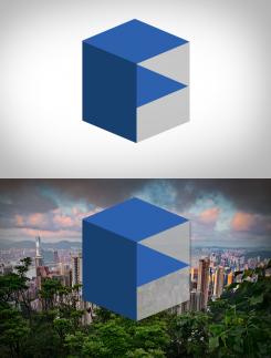
The different color setting (3 different colors) in the cuboid shape represents the first letter of Fiboni, the F. Just like the example of The Verge this will be recognized as a trademark and branding of Fiboni. The gray background within the cubic sign can be transparent or solid in color.
The "fat/bold" font type and simplicity of the cube makes it possible the be easy seen and visible on big distances and small screens. Which is a must during this time of mass-usage of mobile devices.
The geometric-like shapes stand for the connection Fiboni has between it's fields of expertise and interests. It has the intension to generate the feeling for astronomy and science, art, culture and life style.
It's design is made to be symplistic and fits every background color setting.
The design matches with the age of the target audience.
The different color setting (3 different colors) in the cuboid shape represents the first letter of Fiboni, the F. Just like the example of The Verge this will be recognized as a trademark and branding of Fiboni. The gray background within the cubic sign can be transparent or solid in color.
The "fat/bold" font type and simplicity of the cube makes it possible the be easy seen and visible on big distances and small screens. Which is a must during this time of mass-usage of mobile devices.
 Nederland
 België
 France
 Deutschland
 Österreich
 United Kingdom


