No comments
10th anniversary of a global network of local and regional authorities
- Contest holder: United Cities
- Category: Logo design
- Status: Ended
- Files: File 1, File 2, File 3
Start date: 18-11-2013
Ending date: 27-11-2013
It all started with an idea...
A short, interactive guide helped them discover their design style and clearly captured what they needed.
Brandsupply is a platform where creative professionals and businesses collaborate on unique projects and designs.
Clients looking for a new logo or brand identity describe what they need. Designers can then participate in the project via Brandsupply by submitting one or more designs. In the end, the client chooses the design they like best.
Costs vary depending on the type of project — from €169 for a business or project name to €539 for a complete website. The client decides how much they want to pay for the entire project.
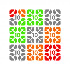
The effect when the logo would be combined: it shows how the 'arms' of the human figures form circles (network)
No comments
My new proposal.
Here the idea of a network is visualized by the stylized ‘human figures holding out their arms ’ in each curved square. They’re like veins of a leaf, making the logo also look a bit like a flower (growth, celebration!)
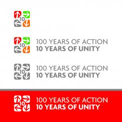
The logo can either be used ‘stand alone’ and in combination with the text, in black and white or using color. Feedback is welcome, let me know if you have further suggestions for improvement.
No comments
Dear United Cities, as you can see, I've been aiming for 'simple and clear' to be the main qualities of this design, since this makes for the strongest and best recognisable logo. I'm looking forward to receive your feedback, best regards, mot
Hi Dit, again I like this logo a lot, I would maybe take out the arrows to avoid the idea of 'going round in circles' but good use of colours and our curved squares
Hmm, that was not the impression I was hoping to achieve… Rather that the arrows would create a network between the curved squares, and an overall idea of ‘connecting to each other’, ‘ongoing development’, etc
 Nederland
 België
 France
 Deutschland
 Österreich
 United Kingdom


