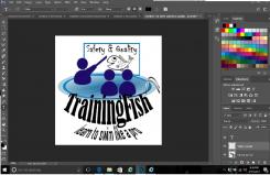
ok! here you go... I have done as you asked!! have kept the slogan and made a connection between fish and pro.
3D, 2D swimming training logo
- Contest holder: TrainingFish
- Category: Logo design
- Status: Ended
- Files: File 1, File 2, File 3
Start date: 17-03-2017
Ending date: 06-04-2017
It all started with an idea...
A short, interactive guide helped them discover their design style and clearly captured what they needed.
Brandsupply is a platform where creative professionals and businesses collaborate on unique projects and designs.
Clients looking for a new logo or brand identity describe what they need. Designers can then participate in the project via Brandsupply by submitting one or more designs. In the end, the client chooses the design they like best.
Costs vary depending on the type of project — from €169 for a business or project name to €539 for a complete website. The client decides how much they want to pay for the entire project.
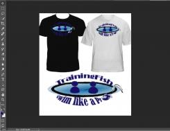
hello again! :). what do you think of this?? I think its simple but effective! also looks a lot better on shirts! and not as many elements.i hope you like! you said you liked the idea so I tried to keep it similar. :)
You know what? Keep the slogan and let's see if you can make the connection between fish and pro when it comes to swimming ;-)
You know what? Keep the slogan and let's see if you can make the graphical connection between fish and pro when it comes to swimming ;-)
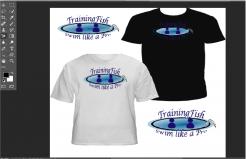
Hey again!! so I did what you asked. I took out a person so its not so crowded. I also changed the font as you asked... I wasn't too sure on the style of font that you wanted but if you want any other changes then let me know and I will change it for you again. I also put it on a t-shirt so you can see what it would look like, and I honestly think it looks awesome and I would buy one of you when there printed. if you choose it. I hope you like. and if you have any other requests then let me know :)
Hey :-) - it looks like we have a little misalignment. What I was referring to in my previous feedback was that the idea per se is nice but there are way too many elements to describe it. I did not meant too many students. The new font can be much better. Think about colors too. Pro is with capital.
If you look on the t-shirt, the space used by the logo is really too much.
I am looking forward to something else, if possible.
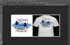
I have came up with this design for you!. I Kept the same name because I like it and thought it was a good name for your services. i made it clear what you do while while showing them that you take pride in safety and quality. i hope you like! :)
Hi, thanks for your work. I like the idea, can we make it more minimalistic? Now it is too much to grasp. The slogan is nice, let's make it shorter: Swim like a Pro. Also, the fonts can be better. Thanks and looking forward!
for sure I can do that!!
 Nederland
 België
 France
 Deutschland
 Österreich
 United Kingdom
