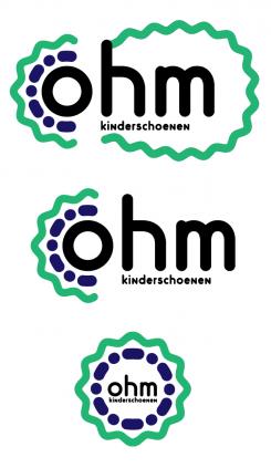
A modern, yet simple and a bit play logo for a children's shoe brand.

Start date: 10-10-2016

Ending date: 17-10-2016

Total budget: € 100.00
Latest design
Book cover
A4+

It all started with an idea...

A short, interactive guide helped them discover their design style and clearly captured what they needed.

Needs


Dear everyone,

Design a modern, simple and yet a little bit playful logo for a new Dutch children's shoe brand. My desire really goes for a modern, simple.....and yet a little bit playful kind of style. A 'simple' logo that we can use for: putting the brand logo in the shoe, the paper, the website etc. But also an easy logo to being able to remember.

Pro's:
-The logo must look fresh and new and inviting.
-The logo shall be used to put on the shoes and shall be used as a statement for everything to follow. Just a strong statement.

Background new company:
Name: OHM (this means resistance)
Style: a style that can be explained as Playful, Modern and Vintage.
Quality: High.
Price: is mid-high segment - which we would like to show to customers.

Advice: The Omega sign can be put into the logo. But this is not a must! See the enclosed attachments of the omega sign. This is just an example but definitely not necessary to use these examples. Please feel free to make it as modern, or whichever kind of logo you want. Because they are just examples and can be definitely better and nicer than the ones you see enclosed.

Please let your creativity go wild. Looking very much forward to your concept.

Thanks in advance!

Company description


<Dear everyone, we have found a winner. It has been a privilege in being able to work with such amazing talents from all over the world. Many thanks for all...and really...ALL your Great Efforts!! For us, as starters, such a website is just a true blessing. Again...thank you everybody!>


Dear everyone,

Design a modern, simple and yet a little bit playful logo for a new Dutch children's shoe brand. My desire really goes for a modern, simple.....and yet a little bit playful kind of style. A 'simple' logo that we can use for: putting the brand logo in the shoe, the paper, the website etc. But also an easy logo to being able to remember.

Pro's:
-The logo must look fresh and new and inviting.
-The logo shall be used to put on the shoes and shall be used as a statement for everything to follow. Just a strong statement.

Background new company:
Name: OHM (this means resistance)
Style: a style that can be explained as Playful, Modern and Vintage.
Quality: High.
Price: is mid-high segment - which we would like to show to customers.

Advice: The Omega sign can be put into the logo. But this is not a must! See the enclosed attachments of the omega sign. This is just an example but definitely not necessary to use these examples. Please feel free to make it as modern, or whichever kind of logo you want. Because they are just examples and can be definitely better and nicer than the ones you see enclosed.

Please let your creativity go wild. Looking very much forward to your concept.

Thanks in advance!

Warm regards!

Target group


Children

Colors, favourites and other requirements


Black or Dark Grey (Antracite)

But am open to other colours.

Designer: Kate Farutina Kate Farutina
logo-kate-farutina-e4xDWlii

No comments

logo11logo11

Dear Designer, Thank you for all the effort that you have made. Just now, we have selected a winner. It has been selected most close to our criteria…and the feeling it suits our brand the most. A message has been sent to Brandsupply to close the competition. Thank you again from the bottom of our hearts!

This contest is finished. Its not possible to reply anymore.
logo-kate-farutina-BEBzGoPw

Kate FarutinaKate Farutina

Same idea of using variations of one logo in different cases. The colors might be all changed to black

This contest is finished. Its not possible to reply anymore.
logo-kate-farutina-E5qLas52

Kate FarutinaKate Farutina

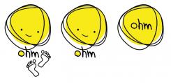
The 1st (left) version is the full one, secind and third are short variations to be used in situations where the full version won't suit. In Black and white yellow becomes grey.

logo11logo11

Hello Kate, thank you for your concept. I like the fact that you show the logo from a completely different angle. I do like the face you show in the yellow field/ face. But I am not sure if it suits what I am looking for. I like the non-chalant style of this...but I seek a bit more tighter kind of style, I believe.

Thank you again for this effort!

This contest is finished. Its not possible to reply anymore.