No comments
A not too serious Fit zonder Bullshit logo it means fit without bullshit
- Contest holder: JoeyJ87
- Category: Logo design
- Status: Ended
Start date: 09-08-2020
Ending date: 16-08-2020
It all started with an idea...
A short, interactive guide helped them discover their design style and clearly captured what they needed.
Brandsupply is a platform where creative professionals and businesses collaborate on unique projects and designs.
Clients looking for a new logo or brand identity describe what they need. Designers can then participate in the project via Brandsupply by submitting one or more designs. In the end, the client chooses the design they like best.
Costs vary depending on the type of project — from €169 for a business or project name to €539 for a complete website. The client decides how much they want to pay for the entire project.
The idea behind this logo is actually, based on three principle.
Fun, Unique & Recognizable.
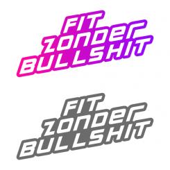
To make you logo fun I use a gradient between purple and pink in which making this logo not only look fun, but also modern.
Abd to make it more unique, I won't use any fitness element in this logo, because for me it will only makes the logo look more generic. Instead I using a strong typeface to symbolize the fit and strong feeling for your logo.
and to make it recognizable. I made sure that the logo won't use too much detail, to make it easily recognizable when mirrored or shrinked
 Nederland
 België
 France
 Deutschland
 Österreich
 United Kingdom


