No comments
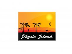
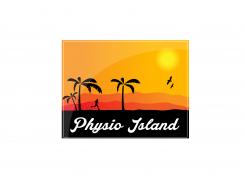
Aktiv Paradise logo for Physiotherapie-Wellness-Sport Center
- Contest holder: sweety010387
- Category: Logo design
- Status: Ended
Start date: 29-04-2014
Ending date: 17-06-2014
It all started with an idea...
A short, interactive guide helped them discover their design style and clearly captured what they needed.
Brandsupply is a platform where creative professionals and businesses collaborate on unique projects and designs.
Clients looking for a new logo or brand identity describe what they need. Designers can then participate in the project via Brandsupply by submitting one or more designs. In the end, the client chooses the design they like best.
Costs vary depending on the type of project — from €169 for a business or project name to €539 for a complete website. The client decides how much they want to pay for the entire project.
No comments
Thanks for the feedback!
Maybe this is an improvement?
I would like to hear what you think.
No comments
Thanks for the stars!
Could you tell me what you like and what you dislike? :)
Or is there something you would like to try with the design?
Hey, I like the Spirit in it. But we think ist too bright,glare in the sunrise Part and we need blue, the Sea in it, you know we need a calming effect. We will have customers who pay a lot of Money for our Service. Maybe the Palms and the runner bigger and if if ist possible not in black. Maybe the Palm leaves green. Good work Keep on.
 Nederland
 België
 France
 Deutschland
 Österreich
 United Kingdom
