No comments
Aviation logo
- Contest holder: Baldauf
- Category: Logo design
- Status: Ended
Start date: 02-02-2014
Ending date: 16-02-2014
It all started with an idea...
A short, interactive guide helped them discover their design style and clearly captured what they needed.
Brandsupply is a platform where creative professionals and businesses collaborate on unique projects and designs.
Clients looking for a new logo or brand identity describe what they need. Designers can then participate in the project via Brandsupply by submitting one or more designs. In the end, the client chooses the design they like best.
Costs vary depending on the type of project — from €169 for a business or project name to €539 for a complete website. The client decides how much they want to pay for the entire project.
Hello,
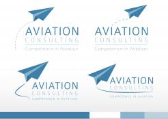
Thanks for the feedback on the first concept. I made some adjustments based upon your feedback. Some variations in which the logo has a slightly more dynamic touch. I showed options with a solid and a dashed line to symbolize the trails. O
f course, a lot of variations are possibly. Did i understand it correctly that the sentence "competence in Aviation" has to be part of the logo? Or are you planning to use it as a pay-off which doesn't have to part of the logo. I choose the first option, but here, but again.. a lot of variations are possible. I hope you like these new concepts. I stayed with the previous color scheme because i think it fits ideal to the line of business you will be involved in. That, combined with a strong message behind this logo('s) i think you can build a strong and unique identity.
All new feedback is welcome, don't hesitate to ask question as well!
Kind regards,
JM
No comments
Yes you are completely right with the message ,I like the paperplane the shadowed Background of the first Picture and the small colored banner of the second one. Can you please integrate the words competence in Aviation. If you add also some lines behind ( like soft condensation trails) the aircraft showing movement would bring a bit more Dynamics .
Question : How would it look like if we move the plane to the left of the words ? Thank you rgds
Hello,
Hereby i present to you my first concepts for the logo for Aviation Consulting. To describe briefly what the idea behind this concept is: the paperplane symbolises the field of work you business is in, as well as the consulting business, but more also the airlines, airports organisations. I think this is a logo that would stand out because it's simplicity, it has a dynamic and positive feeling (reaching for the sky).
Also i presented the color scheme in which the visual identity could be build, based on the logo colors.
I would like to hear your feedback on this concepts.
Thanks in advance!
Kind regards,
JM
 Nederland
 België
 France
 Deutschland
 Österreich
 United Kingdom
