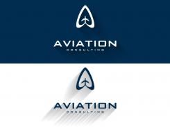
a more pointed symbol, like an arrow !
What do you think?
Aviation logo
- Contest holder: Baldauf
- Category: Logo design
- Status: Ended
Start date: 02-02-2014
Ending date: 16-02-2014
It all started with an idea...
A short, interactive guide helped them discover their design style and clearly captured what they needed.
Brandsupply is a platform where creative professionals and businesses collaborate on unique projects and designs.
Clients looking for a new logo or brand identity describe what they need. Designers can then participate in the project via Brandsupply by submitting one or more designs. In the end, the client chooses the design they like best.
Costs vary depending on the type of project — from €169 for a business or project name to €539 for a complete website. The client decides how much they want to pay for the entire project.
No comments
I like the layout and the Color scheme but a little bit unhappy with the too small aircraft Symbol in that dominant surrounding. Can we change it to a bigger aircraft and a more fragile Frame ? Thanks
The shadows create a lot of Dynamics !good.
No comments
This looks great
This looks great
Hi,
Here is my work for your new corporate identity.
A modern and clean logo with a distinctive icon.
I hope you will enjoy my work as much as I enjoyed working on your project.
Sincerely
Wilko
Hi Wilko , as mentioned above I appreciate the layout The Icon needs a bit of Change. Additionally could you add the words "Competence in Aviation " at the bottom of the box reaching from letft to right ?
 Nederland
 België
 France
 Deutschland
 Österreich
 United Kingdom
