No comments
Brisk logo for clean, white photography website
- Contest holder: Fotocv
- Category: Logo design
- Status: Ended
Start date: 21-01-2015
Ending date: 08-02-2015
It all started with an idea...
A short, interactive guide helped them discover their design style and clearly captured what they needed.
Brandsupply is a platform where creative professionals and businesses collaborate on unique projects and designs.
Clients looking for a new logo or brand identity describe what they need. Designers can then participate in the project via Brandsupply by submitting one or more designs. In the end, the client chooses the design they like best.
Costs vary depending on the type of project — from €169 for a business or project name to €539 for a complete website. The client decides how much they want to pay for the entire project.
Hello,
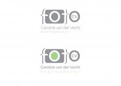
here my new proposal with not so thin font.
I'm afrais my name is just too long creating a long unpractical logo
ok...I understand. I will try to change this logo design
No comments
Hello,
I change the letter "a" and I make to variants with camera.
nice but not sure if this is what i'm looking for. Also it's a bit too thin, I can hardly see it on my laptop screen.
thank you for rating. I will work on it
No comments
Nice idea, I only find the letter 'a' a bit strange and especially the first a in my name as it looks like it's part of the camera outline or something. And what happens if you don't fill up the 'C'?
Nice idea, I only find the letter 'a' a bit strange and especially the first a in my name as it looks like it's part of the camera outline or something. And what happens if you don't fill up the 'C'?
thank you for rating. I will work on it
 Nederland
 België
 France
 Deutschland
 Österreich
 United Kingdom
