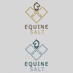
new fonttype and color combination
Clean logo for Horse Therapy Business
- Contest holder: Marly
- Category: Logo design
- Status: Ended
Start date: 28-08-2017
Ending date: 04-09-2017
It all started with an idea...
A short, interactive guide helped them discover their design style and clearly captured what they needed.
Brandsupply is a platform where creative professionals and businesses collaborate on unique projects and designs.
Clients looking for a new logo or brand identity describe what they need. Designers can then participate in the project via Brandsupply by submitting one or more designs. In the end, the client chooses the design they like best.
Costs vary depending on the type of project — from €169 for a business or project name to €539 for a complete website. The client decides how much they want to pay for the entire project.
Coming back on my first proposition... adding also some proof on diffent material.
waiting for your feedback.
thanks,
Amilcare.
Another version.... I hope you like it.
Dear Mary,
I changed more my design because I understood that you prefer to receive something around your idea... in this proposition the shield in addition to representing a safety feature seen overturning also looks like a salon ... to recall the concept of your "salt" business.
It contains two different version of the horse shape, let me know which one you prefer.
maybe starting from this proposition we are close to your idea.
BR,
Amilcare.
Simple and clean... please, let me know if you like, or not and if you want to change something (I understand you have a clear view in your mind).
thsnks,
Amilcare.
Hi Amilcare,
Many thanks for your design! To be honest I had almost exactly the designs that were attached as examples in mind, with a few adjustments.
I like your design too. I prefer the horse facing the right side (for some reason :) and the blue color. Could you make one with light blue and silver instead of the golden one? And could you remove the white lines under the horse. This image of the horse reminds me of a chest peace, it is nice, but if possible I would love to see a more horsy one :)
I hope you don't mind my suggestions, the right logo is VERY important to me :)
Marly
* sorry, meant left facing horse!
Hi Marly, thanks for your feedbacks ALWAYS appreciated and really userful.
Help me understand better your comments: you prefer the lower one (left facing),ok... but I don't understand which is the white line under the horse.
There is a white square that breaks the other blue squares, in the middle.
 Nederland
 België
 France
 Deutschland
 Österreich
 United Kingdom
