No comments
Company Logo Design
- Contest holder: THERB
- Category: Logo design
- Status: Ended
- Files: File 1, File 2
Start date: 27-03-2016
Ending date: 27-04-2016
It all started with an idea...
A short, interactive guide helped them discover their design style and clearly captured what they needed.
Brandsupply is a platform where creative professionals and businesses collaborate on unique projects and designs.
Clients looking for a new logo or brand identity describe what they need. Designers can then participate in the project via Brandsupply by submitting one or more designs. In the end, the client chooses the design they like best.
Costs vary depending on the type of project — from €169 for a business or project name to €539 for a complete website. The client decides how much they want to pay for the entire project.
No comments
Came up with two more
Nice, we're getting somewhere.
More in the style of the bottom one.
No comments
Hi, for the 'pure' version of your logo I've gone for an abstract R and B in a swirl.
I'm very curious to know if this is close to what you had in mind.
Hi,
This is the style of logo that I had in mind yes.
However, this perticular does not do the trick for me. The R and B are not really recognisable I think. Maybe try having the letters turning their back on each other.
Feel free to submit several of theses pure ones and I'll make sure to give you feedback on each one!
Thanks!
No comments
Hi Tjarda,
Sorry for the late response, we are quite busy at the moment.
Anyways, we like the logos you made but there is a similar type from another contestant that we prefer, therefore, I suggest that you turn to a completely different approach.
I personally would prefer an extremely pure logo (like the one from Apple, nespresso, bmw, yamaha and so on..), so if you are up for it, you can turn to this type of logos and submit a few. You have complete freedom, meaning it can have a link to motorcycles or not. As long as it is catchy and instantly recognisable. Simply make it uncolored.
Thanks a lot for your involvement!
Can't wait to see what you can come up with!
No comments
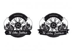
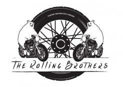
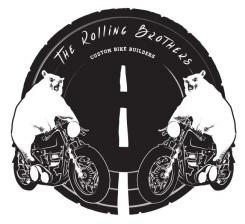
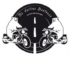
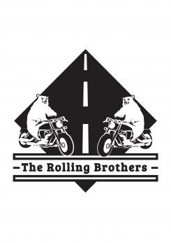
Hi, I've made a few variations with my design, if you have any comments please let me know
Hi,
Good idea to propose various variations at once!
The last one is the one we prefer from the 4.
Can you try to do another design, with the bears on the top half and the rolling brothers in a straight line.
Best,
Charles
No comments
Hello,
Thanks for the feedback, I've gone for a café racer with a bit more detail then in the previous Harley design.
With Regards Tjarda
No comments
Hi,
We like this one a lot more! You might be on to something.
Maybe try to make the bikes a little bit more "café racer" or "scrambler" looking than Harley Davidson. And one of the arm of the bear looks a bit odd I find.
Thanks for the submissions!
Hi,
We like this one a lot more! You might be on to something.
Maybe try to make the bikes a little bit more "café racer" or "scrambler" looking than Harley Davidson. And one of the arm of the bear looks a bit odd I find.
Thanks for the submissions!
 Nederland
 België
 France
 Deutschland
 Österreich
 United Kingdom
