No comments
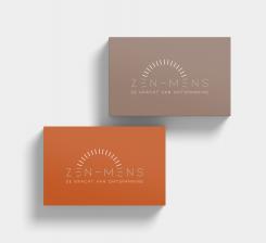
Create a simple down to earth logo for our company Zen Mens
- Contest holder: HolisticTemple
- Category: Logo design
- Status: Ended
Start date: 21-05-2020
Ending date: 28-05-2020
It all started with an idea...
A short, interactive guide helped them discover their design style and clearly captured what they needed.
Brandsupply is a platform where creative professionals and businesses collaborate on unique projects and designs.
Clients looking for a new logo or brand identity describe what they need. Designers can then participate in the project via Brandsupply by submitting one or more designs. In the end, the client chooses the design they like best.
Costs vary depending on the type of project — from €169 for a business or project name to €539 for a complete website. The client decides how much they want to pay for the entire project.
Here is my other attempt, I hope I'm not to far from what you need,
Cheers
Thanks for your attempt.
Unfortunately we don’t have any connection with this logo.
Thank you.
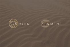
A few more explorations, if there is a favorite don't hesitate to let me know~ I could change the colors up
Hi Daria,
Thanks again :)
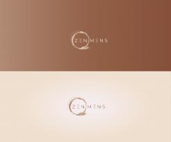
We like the bottom font with the E in 3 lines and we like the circle around the ZEN. So when people read, they first read ZEN. However we are still not completely satisfied with the logo design. For the colours we love earthly colours such as yellow ocher, sand, oxide orange,.
Got it, thanks for the input! :) I'll try again hope you will be satisfied in the end haha
I've made another option even more simplified, hope to hear your feedback on it~
Hello Daria,
Thanks again for your input. It is still not what we are looking for. We enjoy the font a lot though. We miss some elements here.
No comments
Thank you for your design.
We like your spirit and style, but this one does not resonate with us.
Although we like the play of colour. The light that comes out of the centre.
Thank you
Z + M together representing the body in a meditation pose plus personalized font that imitates the shape of the font.
Thank you for your input.
It is too active/sporty.
Greetings,
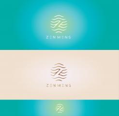
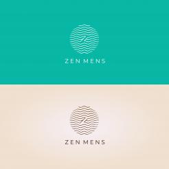
I was thinking to explore the z letter from zen in combination with waves that transmit a sense of relaxation, hope to hear your feedback if this is the direction you're thinking :)
Hi,
We like the style because of the relaxing effect of the waves.
The first impression is zen.
Nice direction but not 100% yet.
We also like the emptiness, the space, the atmosphere and the colours.
Thanks for the feedback! I'll try work based on this one then
 Nederland
 België
 France
 Deutschland
 Österreich
 United Kingdom
