Dear Joel,
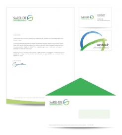
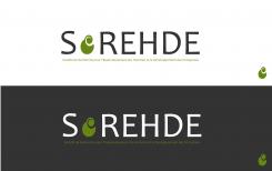
Here is my first design for the contest.
If I have understood correctly, stands Sorehde for development, growth, self-development and
creativity.
The letter "O" in my design symbolizes these characteristics. The "o" breaks through, changes and grows.
Please let me know your findings so I can make the perfect logo for you.
Sincerely,
Agnes Megens
Megens Media Design
Create a visual identity for the brand "SoREHDE"
- Contest holder: sorehde
- Category: Logo design
- Status: Ended
Start date: 17-12-2012
Ending date: 04-01-2013
It all started with an idea...
A short, interactive guide helped them discover their design style and clearly captured what they needed.
Brandsupply is a platform where creative professionals and businesses collaborate on unique projects and designs.
Clients looking for a new logo or brand identity describe what they need. Designers can then participate in the project via Brandsupply by submitting one or more designs. In the end, the client chooses the design they like best.
Costs vary depending on the type of project — from €169 for a business or project name to €539 for a complete website. The client decides how much they want to pay for the entire project.
Dear Agnes,
Sorehde does stand for development, growth, self-development and creativity at work for both individuals at work and HRD.
Even though your logo does describe these characteristics, we feel a less symbolic, more direct one would be better.
As for the font, the characters feel to slim.
 Nederland
 België
 France
 Deutschland
 Österreich
 United Kingdom

