No comments
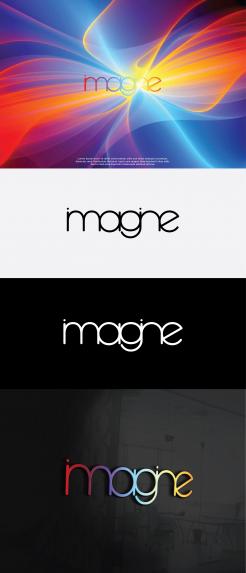
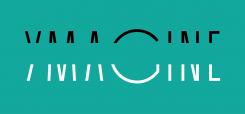
Create an inspiring logo for Imagine
- Contest holder: Ymagine
- Category: Logo design
- Status: Ended
- Files: File 1, File 2, File 3
Start date: 12-09-2018
Ending date: 03-10-2018
It all started with an idea...
A short, interactive guide helped them discover their design style and clearly captured what they needed.
Brandsupply is a platform where creative professionals and businesses collaborate on unique projects and designs.
Clients looking for a new logo or brand identity describe what they need. Designers can then participate in the project via Brandsupply by submitting one or more designs. In the end, the client chooses the design they like best.
Costs vary depending on the type of project — from €169 for a business or project name to €539 for a complete website. The client decides how much they want to pay for the entire project.
No comments
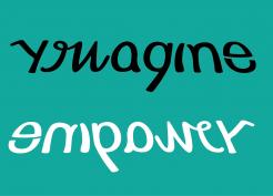
To my flavor it’s still to much of a “home-made” drawing. I miss a stylish finish making it more slick, and professional.
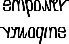
i see that a five star design, with only the word ymagine? I thought you want empower to
I’m not blown away yet. Have shared my inspiration and suggestions to trigger your creativity, Am looking for a beautifully designed logo that triggers the imagination.
So far, at least the sheer simplicity of that 5* rated one stands out.
No comments
Hi logomaker,
You know I like this one, as yours is the computer version of the one drawed and attached. I do miss some stylish edge to it to make it more slick, stand-out and wow.
About the stylish edge, see enclosed a letter style that I think is crisp and sharp.
The logo you propose here but sharp like the attachment will look amazing I think.
https://www.youworkforthem.com/designer/433/fort-foundry/
FYI. Just commented the same also including this link to another proposal in this competition.
No comments
Dank voor het tonen hoe dit er uit ziet. Je oorspronkelijk logo was toch krachtiger
No comments
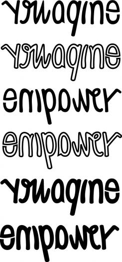
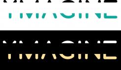
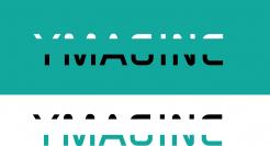
Thanks for all these versions logomaker. Could you show one that is on white background, grey on top letters and gold/copper on bottom? Wonder if the G and the E are readable enough. Need to check with a few people (as I'm biased on knowing what I want to read ;-)
Actually comparing it to your first version, there the letters where bit easier to read
No comments
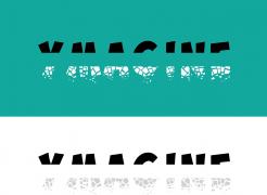
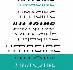
too hard to read this one, but like the options you're proposing
No comments
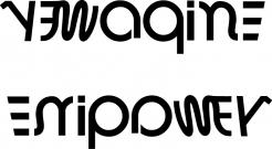
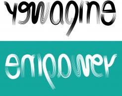
like the experimentation, but don't understand the numbers
it is the numbers of the letters in the alphabet
Ah! thanks for explaining. Prefer a self-explanatory logo, but appreciate you're exploring different routes!
No comments
Think I prefer your first one to these
 Nederland
 België
 France
 Deutschland
 Österreich
 United Kingdom
