No comments
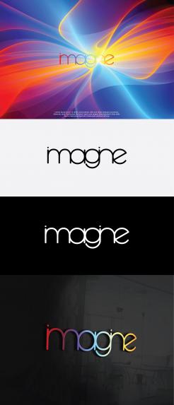
Create an inspiring logo for Imagine
- Contest holder: Ymagine
- Category: Logo design
- Status: Ended
- Files: File 1, File 2, File 3
Start date: 12-09-2018
Ending date: 03-10-2018
It all started with an idea...
A short, interactive guide helped them discover their design style and clearly captured what they needed.
Brandsupply is a platform where creative professionals and businesses collaborate on unique projects and designs.
Clients looking for a new logo or brand identity describe what they need. Designers can then participate in the project via Brandsupply by submitting one or more designs. In the end, the client chooses the design they like best.
Costs vary depending on the type of project — from €169 for a business or project name to €539 for a complete website. The client decides how much they want to pay for the entire project.
No comments
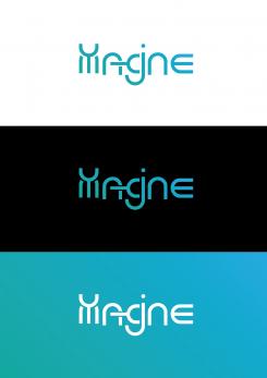
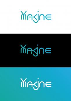
I like some new creativity you bring in here, especially in the repetitiveness of shapes and your way of combining letters.
Would the overall image become more coherent if the Y and the Y in the A&G would be rounded? As all the other letters are also rounded... Am not sure, perhaps it becomes more coherent/consistent or perhaps it becomes more boring, what do you think?
Thanka you for your feedback. I will work on it.
 Nederland
 België
 France
 Deutschland
 Österreich
 United Kingdom


