No comments
Creation of a logo for a new karaté club
- Contest holder: Yakuza54
- Category: Logo design
- Status: Ended
- Files: File 1, File 2, File 3
Start date: 11-04-2013
Ending date: 25-04-2013
It all started with an idea...
A short, interactive guide helped them discover their design style and clearly captured what they needed.
Brandsupply is a platform where creative professionals and businesses collaborate on unique projects and designs.
Clients looking for a new logo or brand identity describe what they need. Designers can then participate in the project via Brandsupply by submitting one or more designs. In the end, the client chooses the design they like best.
Costs vary depending on the type of project — from €169 for a business or project name to €539 for a complete website. The client decides how much they want to pay for the entire project.
No comments
Dear,
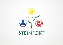
You have announced a contest to design a logo for the Steinfort Karate Club. Preferably an image including the name of the City. I have choosen to use a karateka in action. I have stylisticly drawn the image with a few lines. This leaves room for suggestion aswel gives character to the vignet. People will recognise the images easily as yours. Surrounding the karateka i have places three symbols. The first, the one at the top, represents the star. In the left corner there is the bleu symbol. This symbol stands for defence (The original symbol for defence is a triangle, of which i have made this impression). The thirth and red symbol stands for the perfection of Okinawa. This japanese city is said to be the origin of Karate, my suggestion is to use this symbol in honor of the tradition. Also it could be replaced by a symbol representing the style of karate Steinfort is pacticioning. On the bottom of the logo there is the name of the City.
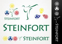
In the second post you can see a few studies on the logo. The fighter seperatly from the other elements of the logo or the three symbols in correlation within a vortex. On the right side there is an impression of the diapositive. Here, I have changed the order of the logo from top to bottom.
The logo is suitable for all purpose. It is easly printed in four colour print, but can be used in one colour easily. The logo as corporate identity can be printed, silkscreaned or stichted on cloting or badge.
At the moment you have suggestions for changes in this logo, i am glad to adjust it to your liking, althoug ofcourse i hope you like the design as is.
Yours sencirely,
Into the box - Design
Dear,
You have announced a contest to design a logo for the Steinfort Karate Club. Preferably an image including the name of the City. I have choosen to use a karateka in action. I have stylisticly drawn the image with a few lines. This leaves room for suggestion aswel gives character to the vignet. People will recognise the images easily as yours. Surrounding the karateka i have places three symbols. The first, the one at the top, represents the star. In the left corner there is the bleu symbol. This symbol stands for defence (The original symbol for defence is a triangle, of which i have made this impression). The thirth and red symbol stands for the perfection of Okinawa. This japanese city is said to be the origin of Karate, my suggestion is to use this symbol in honor of the tradition. Also it could be replaced by a symbol representing the style of karate Steinfort is pacticioning. On the bottom of the logo there is the name of the City.
In the second post you can see a few studies on the logo. The fighter seperatly from the other elements of the logo or the three symbols in correlation within a vortex. On the right side there is an impression of the diapositive. Here, I have changed the order of the logo from top to bottom.
The logo is suitable for all purpose. It is easly printed in four colour print, but can be used in one colour easily. The logo as corporate identity can be printed, silkscreaned or stichted on clothing or badge.
At the moment you have suggestions for changes in this logo, i am glad to adjust it to your liking, althoug ofcourse i hope you like the design as is.
Yours sencirely,
Into the box - Design
 Nederland
 België
 France
 Deutschland
 Österreich
 United Kingdom


