Design a clean and trendy logo for new vegan/vegetarian blog and website

Start date: 27-02-2014

Ending date: 11-03-2014

Total budget: € 150.00
Latest design
Book cover
Soy

It all started with an idea...

A short, interactive guide helped them discover their design style and clearly captured what they needed.

Needs


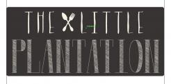
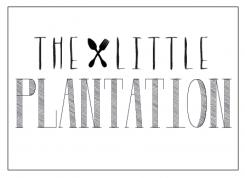
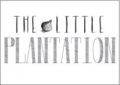
Design a clear and trendy logo for a new vegan/vegetarian blog/website and cafe called The Little Plantation
The logo needs to be
- easily readable
- trendy but not pretentious
- simple
- ideally using no more than 3 colours, including dark grey as a background (think writing on a blackboard/stamp/distressed/vintage)
- logo should work well as top of a website and banner above a cafe
- the logo should communicate elegance and simplicity and is aimed mainly at affluent women in their 20's, 30's and 40's, although not too girly please
we are looking for 2 logos - 1 the main banner ( payment 100Euros)
+
an abbreviated logo i.e. just taking the main initials of the main logo OR using just a symbol from the main logo (payment 50euros)

Company description


The Little Plantation is a food blog/cafe that serves vegetarian food, juices, coffee and vegan treats

Target group


Mainly middle class women in the 20-50 but logo should appeal to as broad a market as possible

Colors, favourites and other requirements


I am open to lots of ideas BUT in my mind the logo is:

dark grey (or very dark green/grey)! background

Writing:
contrasting colour
i.e. bright or pastel yellow
off white/white
pastel purple
pastel green or blue

It needs to be clear that this is a logo for a food/drink/vegetarian site NOT a gardening site

Designer: Lola84 Lola84
logo-lola84-yQag01WS

No comments

This contest is finished. Its not possible to reply anymore.
logo-lola84-xoGxC98S

No comments

venusinblackvenusinblack

This feels too busy for me compared to the other designs.

This contest is finished. Its not possible to reply anymore.
logo-lola84-tU2tZ0OO

No comments

venusinblackvenusinblack

I like your idea to try to bring in colour here, but am worried this can be confused for a gardening site. Also carrot feels too large for the words. In order to bring in colour, can you please try a blue or yellow frame around this instead? Many thanks

This contest is finished. Its not possible to reply anymore.
logo-lola84-oXV77zIO

No comments

This contest is finished. Its not possible to reply anymore.
logo-lola84-nvBOK6uO

No comments

venusinblackvenusinblack

Great! It's really close to what I'm after:)

This contest is finished. Its not possible to reply anymore.
logo-lola84-mgXwiM6K

No comments

venusinblackvenusinblack

Think this is my favourite so far. Also like the dots on the one after this. Might you be able to do this in white background/grey letters to see which works best? REALLY like this:)

This contest is finished. Its not possible to reply anymore.
logo-lola84-lRuV6bKK

No comments

venusinblackvenusinblack

I really like these.

This contest is finished. Its not possible to reply anymore.
logo-lola84-kpamIiwK

No comments

This contest is finished. Its not possible to reply anymore.
logo-lola84-kDH3UqYK

No comments

This contest is finished. Its not possible to reply anymore.
logo-lola84-jaxKgyAK

No comments

This contest is finished. Its not possible to reply anymore.