hi venusinblack,
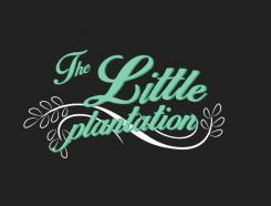
I send you a new design where I tried to place the elements inside the grey area. I think it gives the parts more structure. Let me know what you think. Regards
Design a clean and trendy logo for new vegan/vegetarian blog and website
- Contest holder: venusinblack
- Category: Logo design
- Status: Ended
Start date: 27-02-2014
Ending date: 11-03-2014
It all started with an idea...
A short, interactive guide helped them discover their design style and clearly captured what they needed.
Brandsupply is a platform where creative professionals and businesses collaborate on unique projects and designs.
Clients looking for a new logo or brand identity describe what they need. Designers can then participate in the project via Brandsupply by submitting one or more designs. In the end, the client chooses the design they like best.
Costs vary depending on the type of project — from €169 for a business or project name to €539 for a complete website. The client decides how much they want to pay for the entire project.
I think you are right - it's nice to have it framed, but the square doesn't pull at my heart. How about the circle with the leaves below? I like the font here.
No comments
I really like the simplicity of this and the two fonts are really pretty. The circle is really delicate, but perhaps taking centre stage rather than the letters and I'd love for it to be the other way around.
As per my feedback to one of the ther designers, I am wary about using too many pinky candy colours and going too girly. Any chance we could change that. Really sweet design
Thanks
No comments
Thanks for this. I think the proportions work much better. I feel though like the design is not quite confident enough and a bit timid. Not sure how that can be changed... I hope that makes sense.
No comments
:) Love the cripsness of this one. But feels like the veg is perhaps a little to big in proportion to the words. Really nice though otherwise.
No comments
Thanks you So much :)
I LOVE the -since 2014-. I prefer this to your previous design as it much easier to read and that's important. I also wonder whether letters can be white/off white for clarity and colour can be brought in via a little symbol? Thanks again
sure I can make the fonts in white. I will try not to use so curly fonts. What kind of symbol you had in mind? Some vegetables or something related to coffee?
 Nederland
 België
 France
 Deutschland
 Österreich
 United Kingdom
