More like this?
Design a fitting logo for a yoga-golf teacher
- Contest holder: btimmer
- Category: Logo design
- Status: Ended
- Files: File 1, File 2, File 3
Start date: 17-05-2018
Ending date: 11-06-2018
It all started with an idea...
A short, interactive guide helped them discover their design style and clearly captured what they needed.
Brandsupply is a platform where creative professionals and businesses collaborate on unique projects and designs.
Clients looking for a new logo or brand identity describe what they need. Designers can then participate in the project via Brandsupply by submitting one or more designs. In the end, the client chooses the design they like best.
Costs vary depending on the type of project — from €169 for a business or project name to €539 for a complete website. The client decides how much they want to pay for the entire project.
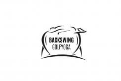
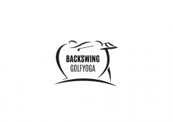
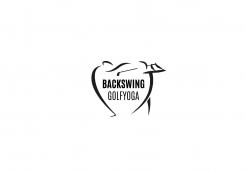
I like it. i like the empahsis on the back bend, and second arm of yoga figure.
the line under makes it less a heart. i think the golf swing can be better, the position of the arms and club. for example if you look at the 3d file, and the figure
on the top, right, its a very emphasized golf swing (im not saying make it like this) maybe have a look at some pictures/ photos of the exact posture of the end
of a golf swing. I think this can still improve. but i like the design.
If I'm going to change the right character, the total balance of the logo will disappear. In my opinion, It's not about the exact golf posture. It's about the recognizability of the postures for people when they see the logo. The graphic aspect is as even important.. if I'm saying this in correct English, if to, I'm sorry :-)
No comments
A good start. I like the symmetry. I don't like that it looks like a heart. Perhaps the figures need more shape than lines, im not sure, people will recognise the left figure as a back bend yoga posture.
 Nederland
 België
 France
 Deutschland
 Österreich
 United Kingdom
