No comments
Design a fresh, happy and cool logo for a dance company with different dance projects for young and old. Alles draait dansprojecten
- Contest holder: LisanneVisser
- Category: Logo design
- Status: Ended
Start date: 21-09-2017
Ending date: 17-10-2017
It all started with an idea...
A short, interactive guide helped them discover their design style and clearly captured what they needed.
Brandsupply is a platform where creative professionals and businesses collaborate on unique projects and designs.
Clients looking for a new logo or brand identity describe what they need. Designers can then participate in the project via Brandsupply by submitting one or more designs. In the end, the client chooses the design they like best.
Costs vary depending on the type of project — from €169 for a business or project name to €539 for a complete website. The client decides how much they want to pay for the entire project.
Another way to play around with this logo.
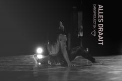
I also made a few variations how to display the logo.
Background picture is from visualhunt.com and ok for commercial use.
Photo credit: <a href="https://www.flickr.com/photos/embajadaeeuubuenosaires/34675155796/">Embajada de EEUU en la Argentina</a> via <a href="https://visualhunt.com/re/638485">Visualhunt.com</a> / <a href="http://creativecommons.org/licenses/by/2.0/"> CC BY</a>
Hello!
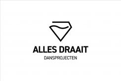
I designed a minimalistic contemporary logo.
I used one of my favourite fonts, which has a very modern feel and is easily readable. The icon replicates diamond and represents both modern dance in it´s simplicity and also hip hop in it´s hidden bling-bling.
Since your brand name has quite a long title, I did not feel the need to add icons of dancers in the logo itself. Although, if you are afraid that people do not recognize that the logo stands for dancing studio, then I would just suggest to print posters: pictures of your dancers with the logo on it.
All the best with finding the best visual!
 Nederland
 België
 France
 Deutschland
 Österreich
 United Kingdom


