No comments
Design a ’fresh’ logo for an urban musicgroup
- Contest holder: NekbrekerZ
- Category: Logo design
- Status: Ended
Start date: 06-02-2020
Ending date: 24-05-2020
It all started with an idea...
A short, interactive guide helped them discover their design style and clearly captured what they needed.
Brandsupply is a platform where creative professionals and businesses collaborate on unique projects and designs.
Clients looking for a new logo or brand identity describe what they need. Designers can then participate in the project via Brandsupply by submitting one or more designs. In the end, the client chooses the design they like best.
Costs vary depending on the type of project — from €169 for a business or project name to €539 for a complete website. The client decides how much they want to pay for the entire project.
No comments
Also a few different fonts. But if you really have a different idea, please let me know.
No comments
The Z has changed, so here are a few ideas.
No comments
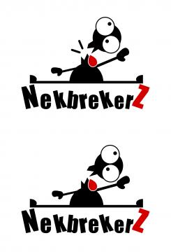
Here already the doll without legs, I am now going to work on the font.
No comments
I have changed it a bit, I am curious how you find it, and what changes you would like.
Thanks tot making the change. Can you remove "the legs?" I'm curious what it will look like without it and maybe play with more colours and fonts?
Tot= for
I mean play with different colours and more fonts
I'm going to make something of it.
No comments
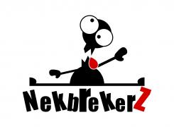
I turned the head and reduced the size of the letters. If there are more wishes, please let me know.
The first one is nice only the Z and the N a little bit lower. So it dont tuch his feed. Just check if you can play with the Z a little bit more. But this is nice man
Thank you. I'm going to play with the letters.
No comments
Martin I like your logo. Can you turn the face a little bit more to the side. And only the N and Z in capital letters like this ( NekbrekerZ). Thank you this is a Nice one.
Martin I like your logo. Can you turn the face a little bit more to the side. And only the N and Z in capital letters like this ( NekbrekerZ). Thank you this is a Nice one.
Thank you for the feadback. I'm just going to make it happen.
 Nederland
 België
 France
 Deutschland
 Österreich
 United Kingdom
