No comments
Design a fresh & modern logo for a Swiss Consumer Goods Company
- Contest holder: dianusska
- Category: Logo design
- Status: Ended
- Files: File 1
Start date: 19-07-2016
Ending date: 02-08-2016
It all started with an idea...
A short, interactive guide helped them discover their design style and clearly captured what they needed.
Brandsupply is a platform where creative professionals and businesses collaborate on unique projects and designs.
Clients looking for a new logo or brand identity describe what they need. Designers can then participate in the project via Brandsupply by submitting one or more designs. In the end, the client chooses the design they like best.
Costs vary depending on the type of project — from €169 for a business or project name to €539 for a complete website. The client decides how much they want to pay for the entire project.
Hi,
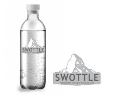
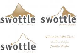
Hereby a new logo. I also used a different illustration of the Matterhorn. I also have the logos placed on bottles. These are the bottles that you had in mind?
I also like to hear what you want to see any more adapted.
Joost
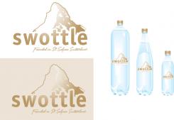
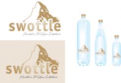
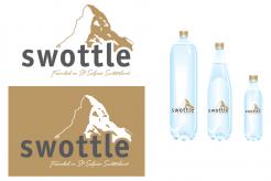
Here is the logo with the adjustments. I made several mountains with different fonts "founded on ...".
Of course you can combine e.e.a..
I hear back from you.
Thanks Joost. I think the design #2 looks promising (upper right corner) and can be a good base for further exploration. Can you please remove the little waterdrop and add ", Switzerland" after St-Sulpice?
No comments
Thank you for youre rating and feedback. I wil make a new logo for you....
Here you receive an idea of the logo. I would appreciate it if you give feedback.
Joost
Hey joost thanks for this initial design. Can we try some of the following:
- fine tune the mountain to really portray the Matterhorn
- I like the idea of the waterdrop, can we try placing it after the "w" instead of after the "s" (+ also one without the drop)
- can we work with different colors (e.g. black and gold) to enhance premiumness
- the "founded in St-Sulpice"needs to become a bit smaller and maybe in a handwritten font?
can you also try replacing the 'o' with the waterdrop?
 Nederland
 België
 France
 Deutschland
 Österreich
 United Kingdom
