Design a logo for a medical scientific research study!

Start date: 01-08-2014

Ending date: 21-08-2014

Total budget: € 229.00
Latest design
Book cover
niki

It all started with an idea...

A short, interactive guide helped them discover their design style and clearly captured what they needed.

Needs


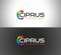
We're looking for a logo with a lively, vital, balanced, energetic and healthy image. The logo will be used in scientific research including participants with chronic physical complaints. The goal of our study is to make participants more active and take control of their lives again.


The logo will be used on letters and questionnaires sent to participants. As participants will receive these repeatedly during a period of 1 year, it would be nice if the logo had high recognisability. The logo will also be used in letters sent to doctors and nurses.

The study is called CIPRUS, which should be the main component of the logo. The title CIPRUS doesn't have a particular meaning in our study, it is simply an abbreviation of the longer name of the study (Cognitive-behavioural Intervention in Primary care aimed at Reducing Undifferentiated Somatoform disorder).

Company description


The research is conducted by VUmc, a large academic medical centre in the Netherlands. Therefore, we are looking for a professional feel to the logo, but not too "hospital"-like.

Target group


Participants in the study (adults of 18-75 years old with unexplained physical complaints), treating physicians and nurse-practitioners.

Colors, favourites and other requirements


The title CIPRUS has to be in the logo. It should be easy to read and in colour, although it's important that the logo still looks good if printed out in black & white.
If possible, our preference goes out to 2 designs: 1 with only the name CIPRUS and 1 with the name CIPRUS and the extended name below (Cognitive-behavioural Intervention in Primary care for Undifferentiated Somatoform disorder).

Designer: plumegraphisme plumegraphisme
design_logo-plumegraphisme-ZLBSNm3U

No comments

katesitnikovakatesitnikova

Hi, thanks for your design. I like the font and the colors, but I'm not sure about the + as I'm afraid it gives the logo a "medical" feel, which I would prefer to avoid.

This contest is finished. Its not possible to reply anymore.
design_logo-plumegraphisme-YirjZtfU

No comments

This contest is finished. Its not possible to reply anymore.
design_logo-plumegraphisme-da9xZl7Q

plumegraphismeplumegraphisme

Hello there,

I thickened the writing and rounded corners police.
Tell me what you think.
Thank you in advance.
Best regards.

This contest is finished. Its not possible to reply anymore.
design_logo-plumegraphisme-yzM028Se

No comments

katesitnikovakatesitnikova

I like the font and the color of the + , however I'm afraid that the logo will look a little too simple in black & white.

This contest is finished. Its not possible to reply anymore.
design_logo-plumegraphisme-cHxaCoOe

No comments

katesitnikovakatesitnikova

I like the font and the color of the + , however I'm afraid that the logo will look a little too simple in black & white.

This contest is finished. Its not possible to reply anymore.