a flat version, more simple, less colors, a real logo I think
Design a logo for a start-up against food wasting !
- Contest holder: raodath
- Category: Logo design
- Status: Ended
- Files: File 1
Start date: 20-01-2014
Ending date: 05-02-2014
It all started with an idea...
A short, interactive guide helped them discover their design style and clearly captured what they needed.
Brandsupply is a platform where creative professionals and businesses collaborate on unique projects and designs.
Clients looking for a new logo or brand identity describe what they need. Designers can then participate in the project via Brandsupply by submitting one or more designs. In the end, the client chooses the design they like best.
Costs vary depending on the type of project — from €169 for a business or project name to €539 for a complete website. The client decides how much they want to pay for the entire project.
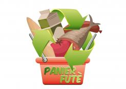
and a version more vintage and hand-made
it reminds me of something organic and eco...
Thanks twigga. I like the vintage and hand-made one.
Regarding the foodstuffs, i'm not fan of the fish.Can you remove it and replace it with a meat for example.
Also, i'm not really fan of the recycling arrows. I think we can figure out something else to convert the green message like a leaf ont the é in "Futé" as the others designers did.
Regarding the font, can you use a more baroque one like the one mikidejavonic is using.
Just a little precision, it's "Futé" and not "Futè".
Thanks twigga
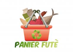
a version with the right basket
same thing as mentionned on the hand made basket.
Plus regaring the handle of the basket can you design it parallel to the screen (i mean in the axe of the screen) and not perpendicular as you did.
Thanks.
and a try with only a smart basket meaning
No comments
thank you for your revision :)
both of those designs could be treated with flat colors as before
No comments
Thanks you twigga. I prefer this one for a start because the arrows on the second one make the logo looks too much loaded.
Secondly, is it possible to design a more real basket, like a brown wicker one, because this basket is still looking like a plastic basket, and not like the one you will bring for groceries in a market.
Thanks
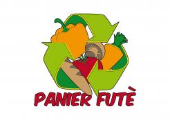
flat version
Thanks twigga for your submission. As mentioned before, we would like a basket to be included in the logo. For example, a basket containing some vegetable, a meat, a yoghourt, a bread: something diversified not only vegetable. And the green harrows are transmitting the ecological message so that's good.
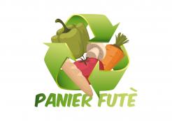
3d version
It is good for a start but we are not only on vegetables but every kind of foodstuffs (fish, meat, yoghourt...). FYI Panier Futé stand for smart basket. So maybe imagine a logo which illustrates the fact that thanks to Panier Futé, you are going to do your groceries cheaper and saving the planet at the same time.
 Nederland
 België
 France
 Deutschland
 Österreich
 United Kingdom
