hello,
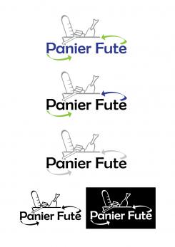
here the new design, i couldn't find out which font mikidejanovic used, that's why i tried to rebuild it (3rd design). i also added some new fonts
best regards,
sel.in
Design a logo for a start-up against food wasting !
- Contest holder: raodath
- Category: Logo design
- Status: Ended
- Files: File 1
Start date: 20-01-2014
Ending date: 05-02-2014
It all started with an idea...
A short, interactive guide helped them discover their design style and clearly captured what they needed.
Brandsupply is a platform where creative professionals and businesses collaborate on unique projects and designs.
Clients looking for a new logo or brand identity describe what they need. Designers can then participate in the project via Brandsupply by submitting one or more designs. In the end, the client chooses the design they like best.
Costs vary depending on the type of project — from €169 for a business or project name to €539 for a complete website. The client decides how much they want to pay for the entire project.
here is the new the design (i deleted the old one because of the bad quality)
i hope you like the new one
best regards,
sel.in
Thanks sel.in
I like the 5th and sixth one because the basket has been designed arount the word panier.
Some remarks:
1) i think bith arrows should be green.
2) Can you write the futé more bigger.
3) put a leaf on the e in futé to convert the green message.
4) can you propose another font? Check another designer font for ex mikidevanovic font and color for ex.
Thanks
thank you for your fast feedback, i'll send you the new designs as soon as possible
best regards,
sel.in
thank you for your fast feedback, here is a new idea for your logo
best regards,
sel.in
Thanks sel.in but i think there is too much information in these...
Can we try something with your arrows.
Can you imagine an arrow starting with the "a" letter in Panier and finishing with the letter "t" in Futé. This arrow should look like an arc and can represent the bottom of the basket. Another arrow should start withe the "é" in Futé as you previously did, and should finish on the "i" in Panier, to look like the handle of the basket.
I'm trying to figure out how to design a basket with your arrows which i think convert the recycling message.
For in instance let's forget the foodstuffs and we will see later.
What do you think about that?
PS: regarding the font, can you use a baroque one like the one mikidejanovic use?
Thanks.
thank you,
i'll send you the new design as soon as possible
best regards,
sel.in
Hello,
I think it's really great that your company is fighting against food wasting.
that's why I created a logo for your company, I hope you like it.
best regards.
sel.in
Thanks sel.in for the support.
Let's say your forget for instance our guidance regarding the basket, the foodstuffs and the green image, what design would you imagine to represent our activity.
I'm trying to figure out what you zould have imagine if i didn't give so many indications. Maybe you could come with something different but concrete.
Thanks
 Nederland
 België
 France
 Deutschland
 Österreich
 United Kingdom
